This topic has 4 replies, 3 voices, and was last updated 8 years, 10 months ago ago by Eva Kemp
Hi,
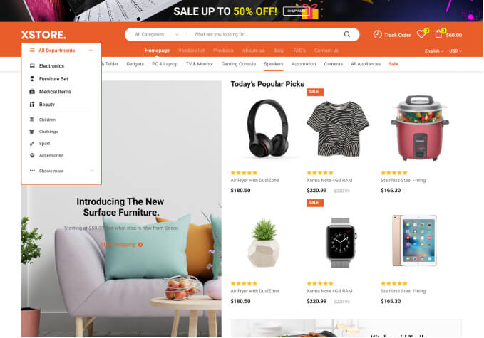
I need some help with the product grid view as different length of product names push the cost + add to cart-button down differently depending how many words are included which looks not so good.
Is it possible to make the product name area fixed with 3 text rows even if it does not fill it up?
I want to have all cost text + Add to Cart-buttom aligned on the same row.
Please, see my before & after examples in Private Content.
Also, how do I get rid of the Product Information text in the hover over description in grid view?
Please see example in Private Content.
Hello,
Please add the following css code in child style.ss:
.slide-item .product .product-name, .products-grid .product .product-name {
height: 55px !important;
}
.product-loop .product .product-image-wrapper .product-mask .mask-text h4, .slide-item .product .product-image-wrapper .product-mask .mask-text h4 {
display: none !important;
}
Best regards,
Jack Richardson.
Hi Jack!
Great news! I just made a child theme today as I realized I need to be able to do some adjustment in some .php. This code did the trick but please check the other one that did not have any effect. (cart table in another thread).
Regards,
Christian
Hello,
You’re welcome.
We’ll reply in the other topic regarding your second query.
Regards,
Eva Kemp.
The issue related to '‘Fixed hight (text rows) of products in grid mode’' has been successfully resolved, and the topic is now closed for further responses