This topic has 18 replies, 4 voices, and was last updated 10 years ago ago by Eva Kemp
Hello,
My mobile version needs help!
1) It looks ok when the phone is turned horizontal but looks really bad when it is turned vertical. Most people hold their phone vertical so I need to improve this! Is there anything I can do??
2) My mobile navigation menu comes up with black background and black letters. “navigation” is in white but the rest is in black. How do I change the letters to white so people can see them?
Note: If you give me a custom css code please clarify where to paste it.
One more thing…
On my site when an item is added to the cart the “you have successfully added this item to your cart” comes up in a green background. This doesn’t match my color scheme at all. I would like for it to be hot pink. Can you please tell me how do do this?
Thank you so much for the help! I appreciate it!
Hello,
1. Please specify what exactly is incorrect? Provide us with the wp-admin panel credentials in Private Content.
2. Please add this code into custom.css file:
.et-mobile-menu li > a {color: #FFF !important;}
To change color of the notification you need use this code in custom.css:
.added-text {background-color: pink !important;}
@media (max-width:480px) {.added-text {background-color: pink !important;}}
To create custom.css you need rename default.custom.css to custom.css via FTP in the directory wp-content/themes/legenda. Then enable it in wp-admin panel > Theme Options > Custom CSS.
Regards,
Eva Kemp.
My mobile version looks great now thank you! the menu worked!
the code for the color notification didn’t work-
When a regular product (that isn’t a variable product (ex no size differences) is added to my cart it looks beautiful- a popup comes up with a little picture of the item and all the coloring looks great that says “product name- has been successfully added to your cart.
On a variable product (like one with sizing) when it is added to my cart the popup doesn’t pop up and this note comes up saying “this item has been successfully added to your cart” in green background and white letters.
Can you please tell me to have the pop up come up when a variable product is added to the cart too??
Thank you!!!!
Hello,
Sorry, but that pop up works only for simple products, not variable ones.
Please provide us with wp-admin panel credentials to check the issue with the background color for notification.
Thank you.
Regards,
Eva Kemp.
Hi Eva, the menu on the mobile version of my website is missing. Could you help with this? Also the visual slider looks very small when mobile phones are held vertically and looks better when it is held horizontally. My details are in private content. Thanks
Hello @bunmizion,
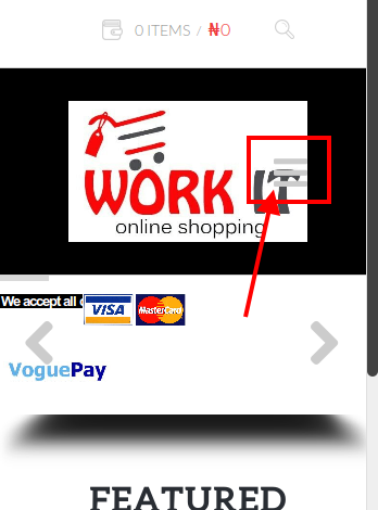
Mobile menu icon is shown:

If you wish we can help you to change its color or move it to some side.
Please check Revolution Slider settings and enable “Force Full Width”.
Thank you.
Regards,
Eva Kemp.
Thanks for your help Eva. Could you move it to the right hand side outside the logo area. Please also make it visible enough for anyone to see easily.. I didn’t know you had responded to my ticket because I didn’t get an email.
Hello,
Please add this code into custom.css file.
@media (max-width: 767px){
.header .menu-icon {
right: -20px;
}
}
Here is a video tutorial how to create custom.css: https://www.youtube.com/watch?v=Qok2zRedRMY&feature=youtu.be.
Regards,
Robert Hall.
Thank you Robert. I have done what you asked and I got the desired result but I will like to take it a step further by adding the words ‘MENU’ next to the icon to make it more dummy-user friendly. How do I achieve this
Hello @bunmizion,
Please provide us with wp-admin panel credentials in Private Content.
Do you wish to add the word “menu” next to the icon and under it? What font size should it have?
Thank you.
Regards,
Eva Kemp.
I would prefer that the word ‘MENU’ is beside that icon with the same hyperlink so that it does what the icon does. My details are in private content. Thanks.
Hello,
I’ve edited header.php file. Keep it safe.
Please replace the previous code with this one in custom.css:
@media (max-width: 767px){
.header .menu-icon {
right: -20px;
}
.menu-icon-text {
font-size: 14px;
margin-right: 30px;
}
}
As you can see the word “menu” and the menu icon are placed very closely. So it would be better place it under the menu icon.
Let us know if there are any questions.
Regards,
Eva Kemp.
Thanks for your efforts but the word ‘MENU’is now on the logo. Could you increase the font to the height of the menu icon and move the word MENU to the right of the icon?
Hello,
If we increase font size of the “Menu” word it’ll overlap on the menu icon.
The best way will be to put it under the menu icon or the logo should be moved to the left if you still want to have “Menu” aligned to the right of the menu icon.
Thank you.
Regards,
Eva Kemp.
Please go ahead and place it under the menu icon. Thank you very much.
Hello,
I’ve edited custom.css file.
Please check the site now.
Regards,
Eva Kemp.
Please could you help add the word menu under the icon like I described earlier in this ticket. My FTP details are below
Hello,
I’ve corrected the code in custom.css file.
Please check the menu icon now.
Regards,
Eva Kemp.
The issue related to '‘mobile version help’' has been successfully resolved, and the topic is now closed for further responses
