This topic has 2 replies, 2 voices, and was last updated 2 years ago ago by Tony Rodriguez
Hello!
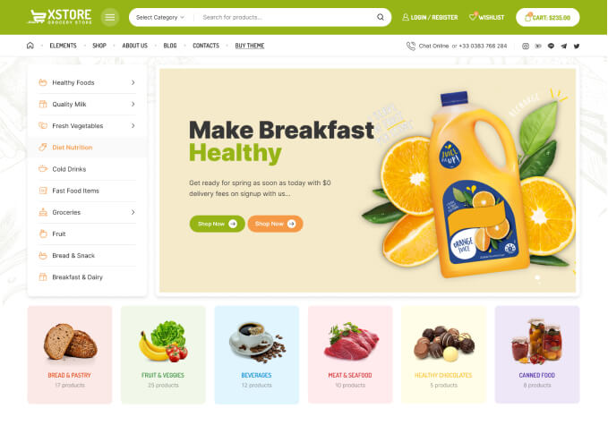
Demo #1
https://xstore.8theme.com/elementor/demos/niche-market02/product/fryer-with-dualzone-2/
In the product pages, the extra side are which has the image and the text (I think it is the extra widget?) is dragging downwards when I scroll down and not “staying put” on the top.
Is there anyway to make that top section (image/text) stay lined up on the top section and then have the description section be full width?
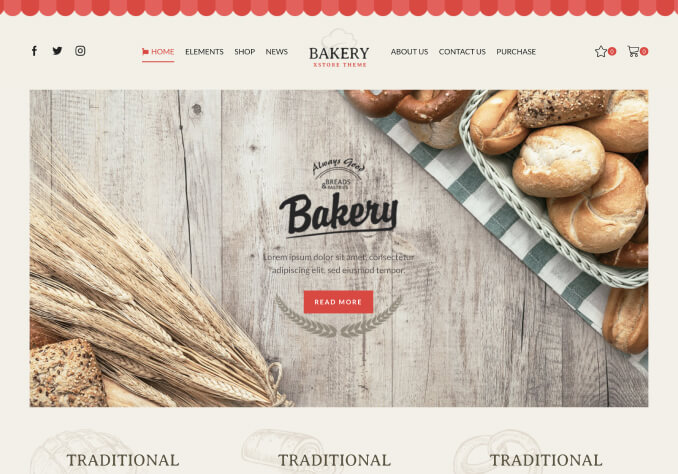
Such as in this demo #2
Thanks!
Hello, @TFS,
In this demo: https://xstore.8theme.com/elementor/demos/niche-market02/product/fryer-with-dualzone-2/ the section is the sidebar and this is the sidebar: https://postimg.cc/2Lv6Gsvx and on this demo:https://xstore.8theme.com/elementor/demos/car-parts/product/sinister-diesel-series-30-power-hydraulics-turbo/ there is no sidebar that’s why it appears like this.
As you know the sidebar works as sticky so in order to solve your issue first you have to set the page layout to full width from the Dashboard >> XSTORE >> Theme settings >> WooCommerce >> Single product Builder >> Layout >> See the image: https://postimg.cc/564yLRy8 and then start building the page as per your need in the single product page builder then save settings and check back to your site after clearing the browser cache.
Regards 8Themes Team.
Tagged: description, full width, page, product, template, woocommerce, wordpress
You must be logged in to reply to this topic.Log in/Sign up