This topic has 13 replies, 2 voices, and was last updated 1 years, 6 months ago ago by Rose Tyler
Hi xstore-Team!
There are so many bugs of the design:
1. I would like to not show the variants in the product catalog.
2. the variants are not crossed out when the stock is 0.
There are also several errors in the **mobile view**:
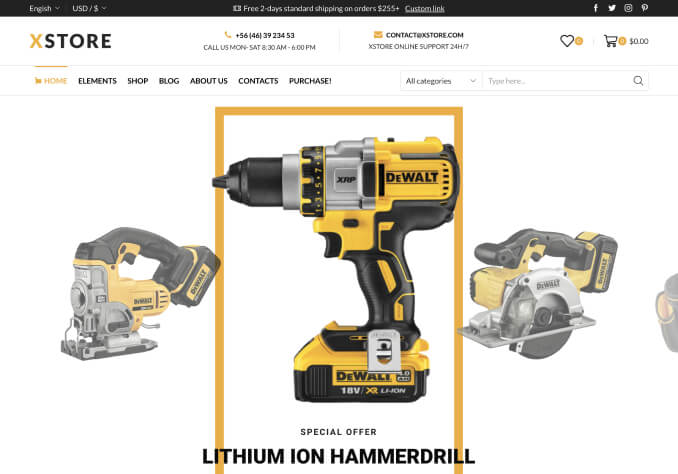
3. The quantity and the add to cart button are below each other not side by side on the product pages, why is that? image 1
4. The button – radius can not be set (should be 10).
5. The shopping cart display is disastrous, nothing can be changed either. Neither font size of the breadcrumbs (much too large on mobile devices), nor the colors or the borders. Also, a representation of the products in the next steps of the checkout, which are in the cart, as seen in image 2, would be much nicer and not at the bottom under the information to be entered.
It would be great if someone could help me, because so I am not satisfied at all. Thanks a lot!
Hello, Helloaksjhf,
Thank you for contacting us and for using XStore.
1/ You can find this option in Theme Options > WooComerce > Shop elements > Variation swatches > Position > select “Disable” > Publish and check the Shop page then.
2/ “Hide out of stock items from the catalog” needs to be enabled in WooCommerce > Settings > Products > Inventory.
3/ You can see the same on our demos – https://xstore.8theme.com/product/american-vintage/
We hope you checked our demos before purchase, because we can help with existing settings, but additional customization is out of our basic support scope.
4/ You need to set border-radius in px, for example, 10px, in Theme Options > Styling.
5/ Please check available settings in Theme Options > WooCommerce > Cart/Checkout Layout.
If you have any additional questions or concerns, please do not hesitate to reach out to us. Our support team is always available to assist you.
Kind Regards,
8theme team
Thanks.
3. In your demo it’s side by side as I want it, please compare the two pictures
4. the buttons checkout, proceed to checkout are not involved in these settings with 10px
5. image 3: its way too big
Another question:
Can the size guide be put on directly next to the size variant and not below it?
Can I change the gallery type only for mobile devices?
If I click on shopping cart (off canvas) the checkout page is shown, not the cart page.
Hello, Helloaksjhf,
Thank you for your responses. Sorry for the delay in answering.
“In your demo it’s side by side as I want it, please compare the two pictures” => please ad the next code in Theme Options > Theme custom CSS > Global:
@media only screen and (max-width: 480px) {
.single-product-builder .et_product-block .quantity-select,
.single-product-builder .et_product-block .quantity-select select,
.single-product-builder .et_product-block .single_add_to_cart_button {
min-width: unset;
}
.et_product-block .cart .quantity {
margin: 0 var(--single-add-to-cart-button-spacing,15px) 0 0;
}
}
“the buttons checkout, proceed to checkout are not involved in these settings with 10px” – you should write value & units in the fields but not just values https://prnt.sc/uTYcMIArFj8B
10 => 10px
“image 3: its way too big” – Size of the image depends on the image you upload for logo. In your case, you can upload a smaller logo than now and use not SVG but jpeg/png format of logo image.
“Can the size guide be put on directly next to the size variant and not below it?” – There is no such possibility, unfortunately.
“Can I change the gallery type only for mobile devices?” – yes, but with changes made in your child-theme/functions.php
Example:
add_action('wp', function() {
add_filter('theme_mod_product_gallery_type_et-desktop', function($value) {
return wp_is_mobile() ? 'thumbnails_bottom' : $value;
});
}, 70);
The list of possible options for gallery types:
‘thumbnails_bottom’
‘thumbnails_bottom_inside’
‘thumbnails_left’
‘one_image’
‘double_image’
‘full_width’
“If I click on shopping cart (off canvas) the checkout page is shown, not the cart page.” – please, add next code to your child-theme/functions.php
add_action('wp', function() {
add_filter('theme_mod_cart_link_to', function($value) {
return 'checkout_url';
});
}, 70);
Kind Regards,
8theme team
Thanks for the response!
With “image 3: its way too big” the font size of the
Shopping cart>Billing details>Payment>Order status is meant.
Furthermore it would be nice if the coupon field would be shown by the payment section, is this possible?
How can I change the link of the “checkout” button (off canvas) to the cart page too?
Thanks 🙂
And the footer widget does not collapse on mobile
And the social media icons can not be aligned left in the mobile sidebar menu
Hello, Helloaksjhf,
Thank you for your response.
The next custom CSS code can be used to change font-size:
.cart-checkout-nav-simple a {
font-size: 15px;
}
There is no such option for the coupon field, unfortunately.
Theme Options > Header Builder > Cart > View Cart Button > On.
If you have any additional questions or concerns, please do not hesitate to reach out to us. Our support team is always available to assist you.
Kind Regards,
8theme team
Thanks!
1. The social media icons can not be aligned left in the mobile sidebar menu and 2. the out of stock label isn’t working.
3. Is there a possibility to send customers a back in stock notification (or have I to download a plugin?)
Hello,
Thank you for your response.
1/ Please provide the URL and screenshots of mentioned icons.
2/ Product variation that is “Out of stock” can be displayed like this -http://prntscr.com/t21xou with our variation swatches (in case “Hide out of stock products from catalog” option is enabled in WooCommerce > Settings > Products > Inventory).
3/ We would recommend you contact support of WooCommerce – https://wordpress.org/support/plugin/woocommerce/
Kind Regards,
8theme team
The issue related to '‘problems variation swatches, design cart, button radius, mobile devices’' has been successfully resolved, and the topic is now closed for further responses