Hello Team,
I’m experiencing an issue with the product grid display on mobile devices. The last column on the right is getting cut off, and users are unable to scroll horizontally to view the missing content.
We tried adjusting the layout to display only three products per row, but the issue persists. It seems that the container is oversized or misaligned, causing the products to extend beyond the screen width.
Could you please provide guidance on how to properly adjust the container width or resolve this issue?
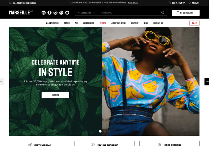
You can see an image with the problem seen on a cell phone screen and I also attached a user in case you need to enter WordPress
Thanks in advance!


