Hello,
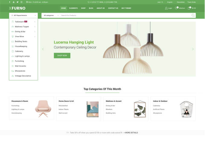
why the images in two column layout in mobile view are so strange and cropped and right aligned?
Same product images in another two themes tested looking great because they have image options like “Cover, filled, contain”… in product grid widget.
Your theme widget for product grid only have option like move image to left, move image to left/right via Image Position X or move image up and down via Image Position Y.
Check also attached screenshot and url to page with our issue.
We also can send you the url from stage with woodm…. theme where you can see same page with same products in grid which looking pixel perfect:
All images are fully shown and they are not cropped left or right.
After switching to storefront we need to adjust the image position per x and y line and its still not looking perfect.
Second issue:
Check the attachd video in private ontent area please. You can see how bad the responsive view is looking… the images are getting cropped.
In the video you can see some other themes how good they work in responsive view: The image is only resized, but not getting cropped. And its always looking pixel perfect.
How to have this with your theme also?
BR
Tommy