This topic has 16 replies, 5 voices, and was last updated 9 years, 5 months ago ago by Jack Richardson
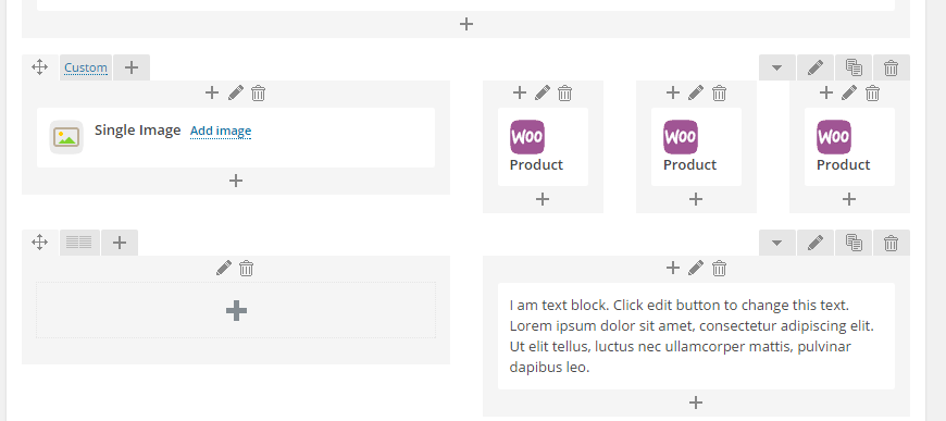
I am trying to put a main image in half the row & then split the other half row into 3. In the other 3 i want to put a product in each, when i do this the products overlap on top of each other. I have tried this in several different ways & it doesn’t work, i have tried it in the page & also as a static block but still hasn’t worked. Can you have a look & let me know your thoughts on how i can fix this?
Is there a way to make the product fit the row?
Page that overlaps: https://www.marygrant.com/be-inspired/
I have put the login details below
Hello,
You may try to add the following code in custom.css file
@media screen and (min-width: 1200px){
.page-id-17544 .sidebar-position-without .row-count-4 .product {
  width: 205px !important;
}}
Here is a video tutorial how to create custom.css: https://www.youtube.com/watch?v=Qok2zRedRMY&feature=youtu.be.
Regards,
Robert Hall.
Hello,
I’ve added this code in CSS block of Visual Composer editor:
http://storage3.static.itmages.com/i/15/0602/h_1433239145_1398859_53af78f0fb.png
Please check the page now.
Regards,
Eva Kemp.
That is brill, thanks a lot for that. I am also looking to put a text box underneath the 3 products, is it possible to drop the box in the white space on the right of the main product & underneath the 3 products?
Sorry 1 other thing is when i hover over a product i only see the add to wishlist button & the Quickview button is dropped below & cant be seen?
Is there a way to have the 2 showing on screen?
Hello,
Please use this code in custom.css file
.add_to_wishlist,
.footer-product span{
font-size 8px;
}
.show-quickly{
  padding-right: 5px;
  margin-top: 5px;
}
Regards,
Robert Hall.
Thanks robert if i upgrade the theme will i loose all these changes??? If i made a child version would this resolve this?
Do you have a tutorial on how to make a child version in my theme?
Is there a way to drop the text from running the full width to just sit under the 3 products?
Hello,
all changes made in custom.css will not be lost on theme update.
If you have edited other theme files – please move these ones to child theme folder before update.
More information about child theme can be found here:
http://codex.wordpress.org/Child_Themes
for your last request – please set row width to 1/2 + 1/2 like we have done on the bottom of your page:

Regards,
Stan Russell.
Thanks Stan, i have done the suggested amend but there is still a big white space between the 3 products on the right & my text box which is now on the right: https://www.marygrant.com/be-inspired/
Is there a way to tighten this up so that the text sits directly below the products?
Hello,
I’ve added margin value for the text column in Visual Composer editor.
Please check the page https://www.marygrant.com/be-inspired/ now.
Thank you.
Best regards,
Jack Richardson.
Jack that is perfect, do you mind me asking how you done it & where it was done so i will know for the future?
Thanks
Hello,
Please view these screenshots:
http://prntscr.com/7cacxz
http://prntscr.com/7cadgz
Thank you.
Best regards,
Jack Richardson.
Sorry Jack i have just checked this on 3 mobile devices & it seems to be overlapping the bottom product. So the text goes up into the last product in the above row. Is it possible to resolve this on mobile devices?
Hello,
I’ve recreated the block in Visual Composer as shown on the screenshot:
http://prntscr.com/7cjr5e
Here is the sequence:
1. Add new element “Row”.
2. Divide it into 2 columns.
3. Add new “Row” to the 2-nd column and divide it into 3 columns.
4. Append element “Text block” to the 2-nd column as shown on the screenshot http://prntscr.com/7cjsjd .
Please check your site now.
Thank you.
Best regards,
Jack Richardson.
10 out of 10 Jack thats brilliant, it makes sense to so it this way alright.
Hello,
You’re welcome.
Regards,
Jack Richardson.
You must be logged in to reply to this topic.Log in/Sign up
