Customizing the appearance of your WordPress website is an essential part of creating a unique and attractive online presence. While the Xstore WordPress theme offers a wide range of built-in customization options, there are times when you may need to apply custom CSS code to achieve a specific design or functionality. In this article, we will explore the optimal placement for custom CSS code in the Xstore theme, helping you make informed decisions about where to add your custom styles.
There are three primary locations where you can incorporate custom CSS code:
- Under Theme Options, you can find the Theme Custom CSS section.
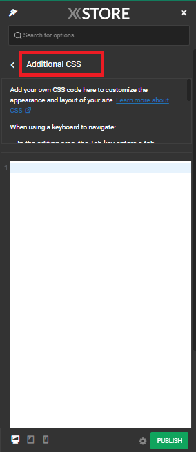
- Another location is the Additional Custom CSS section, also under Theme Options.
- Lastly, you can add it to the
style.cssfile of the child theme.
You have the flexibility to use only one of these locations or all of them. However, please ensure that you do not duplicate the code and remember where each code was added.
We would recommend using the Theme Custom CSS areas.

Xstore Theme Custom CSS
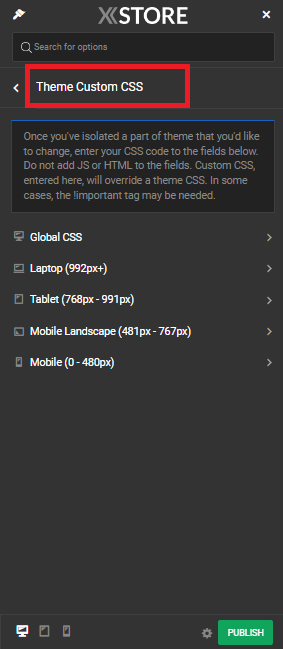
Xstore simplifies the process of adding custom CSS code by providing dedicated options within the theme settings. These options are located under “Xstore > Theme Options > Theme Custom CSS” and offer specific CSS code boxes for different devices:
Global CSS: This is a versatile option that allows you to apply CSS code globally across all device types – desktop, tablet, and mobile. The code you enter here will be saved in the database and applied to your entire website.
Laptop CSS: If you have specific styling requirements for laptop/desktop screens, you can use this CSS box. Any code added here will target only larger screens, providing a tailored experience for users on laptops or desktop computers.
Tablet CSS: Tablets have their own unique display characteristics, and the Xstore theme acknowledges this by offering a dedicated CSS box for tablets. Any code added here will apply exclusively to tablet devices.
Mobile Landscape CSS: For devices in landscape orientation, such as smartphones held horizontally, you can input custom CSS code in this box. This allows you to fine-tune your website’s appearance for these screens.
Mobile CSS: The mobile CSS box is designed for portrait-oriented mobile devices. It allows you to apply CSS styles that enhance the user experience on smartphones held vertically.
Choosing the Right Location for Custom CSS
When deciding where to place your custom CSS code in the Xstore WordPress theme, it’s crucial to consider your specific needs and goals. Here are some key factors to help you make an informed choice:
Scope of Styling: If your styling changes need to be applied universally across all devices, the “Global CSS” box is the most suitable option. This ensures consistent design elements throughout your website.
Device-Specific Styling: When your styling requirements differ based on the device type or orientation, it’s best to use the dedicated CSS boxes for that purpose. For example, if you want to make adjustments specifically for tablet users, use the “Tablet CSS” box.
Export/Import Considerations: If you plan to export and import your theme settings, be aware that the “Theme Custom CSS” is included in export files, while “Additional CSS” (if used) is stored separately in the database and not included by default in exports. Choose the appropriate location accordingly to ensure your customizations are portable.

Child Theme: For more advanced users or those who want to keep their custom CSS in a separate file, using a child theme’s style.css file is a viable option.


