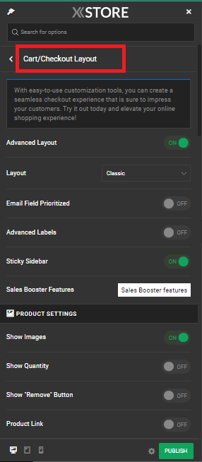
XStore is a versatile and feature-rich WordPress theme designed to enhance your WooCommerce-based online store. Among its many customization options, the ability to personalize the cart and checkout pages stands out as a game-changer. These pages play a crucial role in the customer’s journey, and tailoring them to your brand’s identity can significantly impact your conversion rates.
Xstore Theme’s Cart/Checkout Layout Feature #
Xstore theme offers a Cart/Checkout Layout feature that allows you to tailor the appearance and functionality of your cart and checkout pages. To get started, follow these simple steps:
- 1. Access Theme Options: Go to XStore > Theme Options in your WordPress dashboard.
- 2. Navigate to Woocommerce: Once in Theme Options, click on Woocommerce.
- 3. Select Cart/Checkout Layout: Within the Woocommerce options, you’ll find the Cart/Checkout Layout tab. Click on it to reveal more customization options.
- 4. Enable Advanced Layout: Here, you can choose between a few layout options: Classic, Multistep, and Separated.

Customization Options #
Now, let’s delve into the various customization options available to you:
Email Field Prioritized: To streamline the checkout process, you can prioritize the email field by moving it to the first position in the billing details form. This ensures that customers fill in their email address promptly.
Advanced Labels: This feature adds aesthetically pleasing animated labels when users fill out forms on the checkout page, enhancing the overall user experience.
Sales Booster Features: Enable built-in sales booster features designed to expedite product sales. You can refer to the documentation for more details on these features.
Product Settings #
Further customize your cart and checkout pages with these options:
Show Images: Display product images in the order details information on the checkout and thank-you pages, providing visual cues for your customers.
Show Quantity: Allow customers to change the quantity of products displayed in the order details on the checkout page, giving them greater control over their purchase.
Show “Remove” Button: Include a “Remove” button for products in the order details, allowing customers to easily remove items they no longer wish to purchase.
Product Link: Enable this option to let customers access the product page by clicking on either the product title or image in the order details.
Header Customization #
Enhance the header section of your cart and checkout pages with these options:
Use Header Builder: Create multiple headers and set conditions to display them on the cart and checkout pages or use the default header that appears across your website.
Site Logo: Upload your logo image to personalize the header section.
Retina Logo, Logo Width (Px), Full-Width Header, Header Sticky, Min Height (Px), Background Color, Background Image, Border Style, and Border Color: These options give you complete control over the header’s appearance.
Footer and Copyright Customization #
Customize the footer and copyright sections of your cart and checkout pages with these features:
Use Default Footer: Decide whether to use the default footer or create a custom one.
Background Color and Background Image: Set the background appearance of your footer.
Content: Customize the footer content using HTML tags, but please note that not all tags and element attributes can be used due to Theme Options safety reasons.
Use Static Block: Consider using a static block to enhance your footer’s functionality and design.
Copyrights: Customize the copyright section just like the footer, but be mindful of the HTML tag restrictions for safety reasons.
By taking advantage of these customization tools, you can create a cart and checkout experience that aligns with your brand, provides an intuitive journey for your customers, and ultimately increases your conversion rates. So, don’t hesitate to explore these options and elevate your online shopping experience today!


