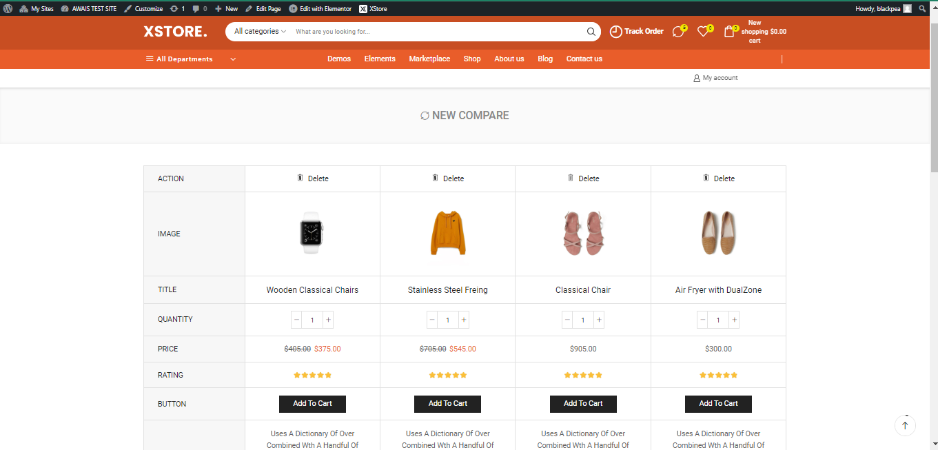
In the world of e-commerce, providing customers with tools to make informed purchasing decisions is essential. One such tool is the built-in compare feature, a valuable addition to any online store. This feature allows shoppers to compare different products side by side, helping them choose the one that best suits their needs. In this article, we’ll explore how to utilize the built-in compare feature in the Xstore theme for WooCommerce.

Enabling the Built-In Compare Feature #
To start utilizing the Built-In Compare feature, follow these steps:
- 1. Navigate to Xstore > Theme Options > WooCommerce.
- 2. Find the Built-in Compare section.
- 3. Enable the Built-In Compare option.
With this simple toggle, you can activate the feature and begin configuring it to suit your needs.

Customizing the Compare Feature #
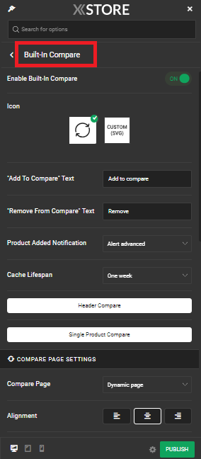
Icon Selection: You have the flexibility to select an icon for the compare feature. You can choose from available icons, deactivate it entirely, or opt for a “Custom” variant by uploading your own SVG icon using the provided form.
Text Customization: Customize the text for the “Add To Compare” and “Remove From Compare” buttons. Tailoring these labels can help align the feature with your brand’s language and style.
Product Added Notification: Select the type of notification that will be displayed when a product is successfully added to the compare list. A well-designed notification can provide users with instant feedback on their actions.
Cache Lifespan: Configure the cache lifespan to determine how long compared product data is stored. This can help optimize the performance of your website by managing the data efficiently.
Compare Page Settings #
Main Compare Page: Choose a page to serve as the primary Compare page. Don’t forget to add the [xstore_compare_page] shortcode to the page content. You can also opt for the “Dynamic page” option, which creates a compare page based on the “Account” page link with additional query parameters added to the URL.
Alignment: Determine the alignment of the content within the compare table. This ensures that the presentation of compared products looks visually appealing and coherent.
Table Content: Customize the contents of the compare page effortlessly by toggling elements on or off. This gives you full control over what information is displayed when products are compared.
Empty Compare Content: Here, you can write custom HTML for the empty compare page. However, keep in mind that not all HTML tags and element attributes can be used due to Theme Options safety measures. You can also leave the content blank to use the default content provided.
Header Compare Options and Single Product Page Compare Options #
Xstore goes the extra mile by offering Header Compare options and Single Product Page Compare options for further customization:
Header Compare: To configure the header compare options, go to Xstore > Theme Options > Header Builder > New Compare. Here, you can fine-tune all available settings to match your specific requirements.
Single Product Page Compare: To configure the single product page compare options, navigate to Xstore > Theme Options > WooCommerce > Single Product Builder > New Compare. As with the header compare, you can check and set all available settings to align with your preferences.
By taking advantage of the Built-In Compare feature and its numerous customization options, you can enhance the shopping experience for your customers, provide valuable product comparisons, and ultimately drive more conversions on your e-commerce website. So, why wait? Activate and tailor this feature today to stand out in the competitive online marketplace.


