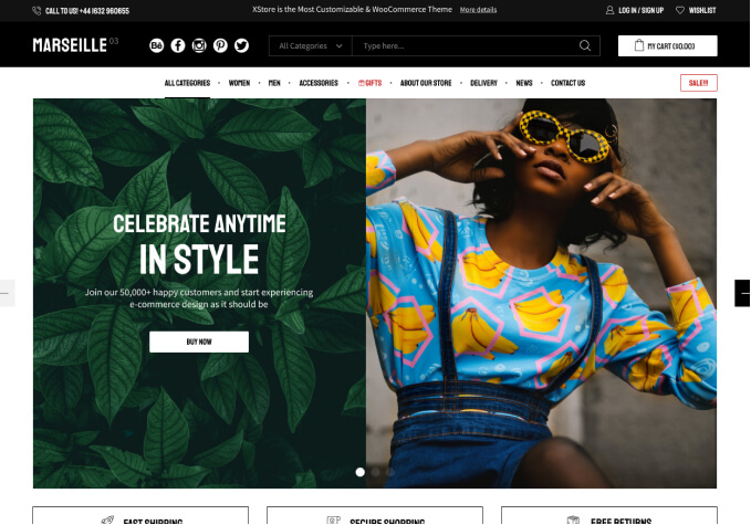
Unlock Maximum Conversions with the Right WooCommerce Continue Shopping Button Colour
The Continue Shopping Button Colour in Best Selling WooCommerce Themes is an important but easily overlooked detail when it comes to creating an online store that will attract customers and make them want to purchase from you. It's the first thing potential customers see when they land on your site, and the colour of the button can make a big difference in their decision whether to stay and shop.
Having a good colour palette for your store is essential, and the best way to achieve that is by having a consistent colour scheme throughout, including your “Continue Shopping” button. A great place to start is by selecting a colour that reflects the personality of your store. If you have a fun and quirky store, then a bright and cheerful colour like yellow or pink might be an excellent choice. On the other hand, if you’re selling timeless and luxurious items, then a muted hue like blue or grey could be a better choice. The important thing is to think carefully about the tone you’re trying to set.
It’s also important to consider the practical implications of your choice of “Continue Shopping” button colour. It should stand out from the rest of the page, or it risks being overlooked and forgotten. Using a colour that contrasts with the other elements of your page is your best bet. For example, if the rest of your page is fairly dark, then a colour like orange or yellow would work well. On the other hand, if your page is light, then a darker colour like navy blue or black would be the right choice.
A good “Continue Shopping” button colour should be easy to read as well. It should be visible from a distance, as well as when customers are scrolling through their shopping carts. Opting for a colour that’s in the same colour family as the rest of your store is a safe bet, but if you’re feeling adventurous, then don’t be afraid to go for something brighter or more vivid.
Finally, it’s worth noting that, depending on the platform you’re using, you may be able to customise your “Continue Shopping” button colour. This is a great way to make sure it stands out from the rest of the page, while still being in keeping with the overall look and feel of your store.
The “Continue Shopping” button colour is an important detail that shouldn’t be overlooked when creating an online store. A good colour choice can make a big difference to the overall look and feel of your store, and can help encourage customers to purchase from you. Take the time to select a colour that’s in keeping with the personality of your store, stands out from the rest of the page, and is easy to read. Customising the colour is a great way to make sure it’s just right.