Solve Mobile Breakpoint Issues in WooCommerce WordPress Templates
Have you ever faced difficulties in viewing WooCommerce WordPress Templates on your mobile device? If so, you've probably come across the dreaded mobile breakpoint issues that can hamper your experience, and potentially affect your business. In our digitally driven world, online shoppers demand seamless shopping experiences across all devices. Yet, WooCommerce WordPress Templates often struggle to deliver the same user experience on mobile devices as they do on desktops.
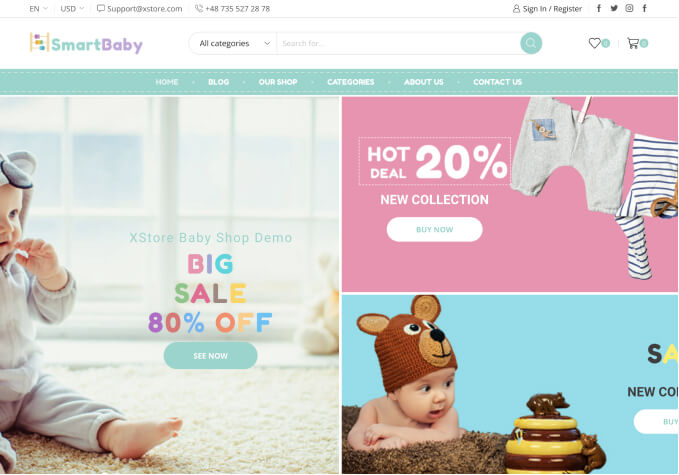
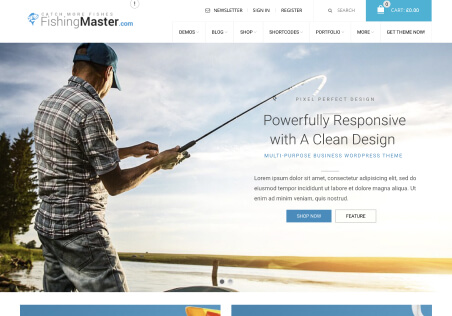
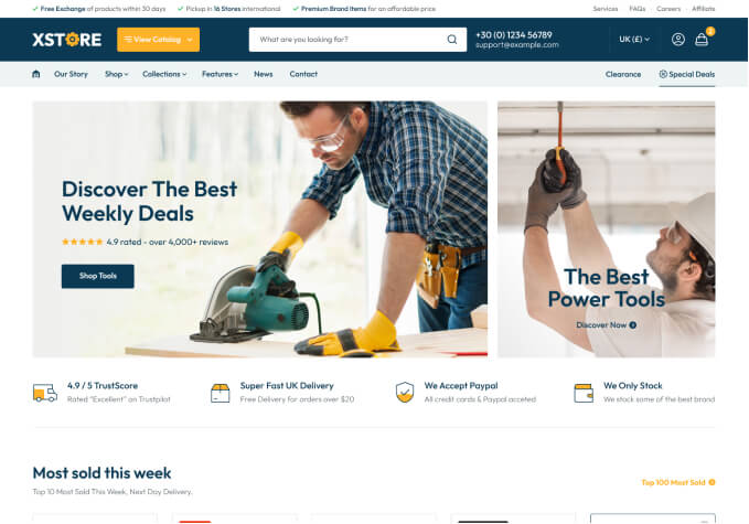
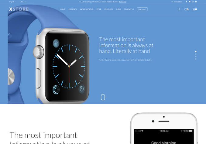
WooCommerce WordPress Templates, though well-designed for desktops, can pose challenges when viewed on mobile devices. Mobile breakpoint issues mean that the layout, images, or functionality don't adapt and display correctly on a smaller screen. As a result, your customers may find your site hard to navigate, off-putting, and are more likely to abandon their shopping carts. For you, it means lost sales and compromising your brand reputation. It is a potent problem that needs a robust solution.
So, what is the solution to this pervasive issue? It involves ensuring that your WooCommerce WordPress Template incorporates responsive design principles. Responsive design is all about optimizing your online store for various screen sizes - desktop, tablet, and mobile. It is dynamic, adaptable, and ensures that your site maintains its functionality, aesthetics, and user-friendliness across all devices.
As a business owner, you cannot afford to overlook mobile breakpoint issues in WooCommerce WordPress Templates. You must ensure that your customers enjoy a seamless shopping experience on any device they choose to use. Optimizing your WooCommerce WordPress Template for mobile devices can increase your mobile traffic, conversions, and overall sales.
In conclusion, tackle mobile breakpoint issues head-on by adopting responsive WooCommerce WordPress templates. Ensure your online store's success by providing your customers with an incredible mobile shopping experience. It is more than just a recommendation; it's a necessity in our mobile-first world. Don't let your business lag behind, but instead stay ahead of the curve by providing a seamless user experience across all devices.