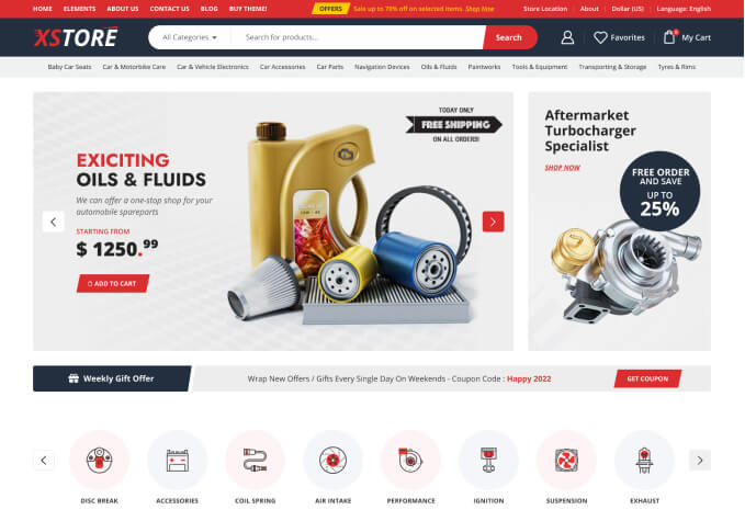
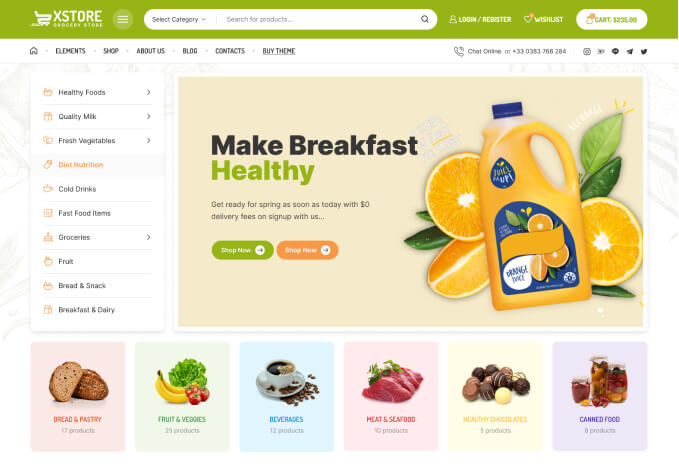
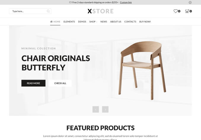
Optimize UX with Mobile-Friendly Headers in WooCommerce Themes
Invest in the pinnacle of business symbiosis with the Mobile-Friendly Headers featured in our top-selling WooCommerce Themes. As technology continue to evolve, so must the manner in which we connect with our customers. Responsive mobile design is no longer just an optional feature, it's a requisite for a successful online storefront, and our WooCommerce themes are meticulously crafted with this in mind. With our mobile-friendly headers, your customers can effortlessly navigate your site from any device. It’s time to step up your digital game and cater to the needs of your on-the-go customers - and we're here to help you do just that.
Our WooCommerce themes offer versatility, adaptability, and innovation in their design. The mobile-friendly headers are the first point of interaction the viewer experiences. Hence, we've made sure they're intuitive, neatly organized, and visually appealing. This ensures your customers get the easiest user interface that translates you’re your brand's values perfectly. Minimize their search time and increase your profits!
The mobile-friendly headers not only make navigation smoother but they automatically adjust to fit any screen size. This implies that your customers can enjoy the same convenient shopping experience whether they are using a smartphone, tablet, or desktop. It gives your online store a professional look and feel, building trust with your visitors right from their first interaction.
But that’s not all! Our mobile-friendly headers in WooCommerce themes are also SEO-friendly. This feature will significantly improve your website's ranking on search engines, attracting more organic traffic to your site. In addition, faster loading times reduce bounce rates, keeping potential customers engaged and not frustrated with waiting. This boosts not only your accessibility but also your findability, a true win-win situation!
Don’t let your website fall behind in the fast-paced digital world. Our WooCommerce themes with mobile-friendly headers will ensure your online store is at the forefront of technological trends, always providing an exceptional user experience. You’ll create a strong first impression, cater to a wider audience, and ultimately, drive more sales. Simplify your customer's mobile journey today with our best-selling WooCommerce themes. Your success is just a tap away!