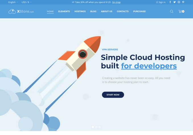
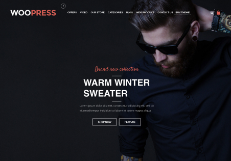
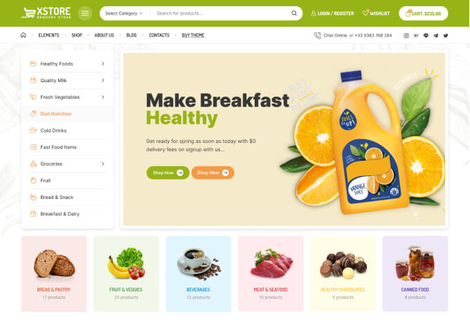
Optimize Mobile Portrait View with Top WooCommerce Themes
Revamp your online store for better mobile user experience with the new Mobile Portrait Adjustments in WooCommerce WordPress Templates. As a business owner, your prime focus should be creating an easy, navigatable, and visually engaging interface for your consumers, no matter what device they are using. It’s more important than ever to fine-tune your design to accommodate mobile users, something that the Mobile Portrait Adjustments feature does brilliantly. This feature opens up a whole new dimension of mobile responsiveness that not only enhances the aesthetics but also improves the functionality of your WooCommerce store on mobile devices.
The Mobile Portrait Adjustments feature recognizes the importance of mobile shopping and brings forth the ultimate solution to meet your customers' expectations on smaller devices. The superb precision of this tool allows you to adjust and refine the design elements in your WooCommerce template to favor mobile devices. You can easily tweak size, style, positioning of the typography, images, buttons, and all other elements on your site. The result is a clean, compact yet fully functional mobile interface that instantly catches the eye of your customers.
The great advantage of Mobile Portrait Adjustments lies in its intuitive control. It gives you the liberty to manipulate different aspects of your WooCommerce store for mobile view without affecting the desktop version. It simply means you can create a mobile-friendly store without compromising the aesthetics and functionality of your website on larger screens. And the best part - you don’t need to be a coding expert to use this feature. Its user-friendly nature makes it accessible for all, whether you’re an experienced web designer or a small business owner with no coding knowledge.
Another notable feature of Mobile Portrait Adjustments is how it improves the loading time of your WooCommerce store on mobile devices. By optimizing the layout, images, and other elements for mobile view, your site becomes less resource-demanding. This translates to faster loading times on mobile devices, thereby enhancing the user experience. A site that performs well, regardless of the device used, is bound to attract and retain more customers.
In conclusion, by investing in the Mobile Portrait Adjustments in WooCommerce WordPress Templates, you are investing in the future of your online store. Ensure that your customers enjoy a smooth, seamless, and engaging mobile shopping experience. Watch as your business growth skyrockets as you keep up with the fast-paced, mobile-first world of e-commerce. Don't miss out on the incredible opportunity that Mobile Portrait Adjustments bring to your WooCommerce store. Give your mobile shoppers the best online shopping experience and reap the benefits of a successful and profitable online business.