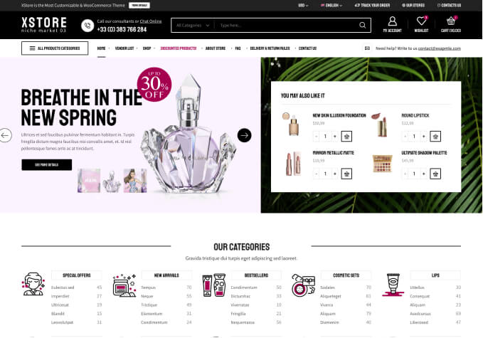
2-col product categories widget on mobile doesn’t work

This topic has 4 replies, 2 voices, and was last updated 1 years, 1 months ago ago by Tony Rodriguez

  • Avatar: ecommercedev
    ecommercedev
    Participant
    October 1, 2023 at 13:38

    Hi,
    I prematurely closed https://www.8theme.com/topic/change-number-of-column-for-product-categories-widget/#post-368976 ticket.

    I am particularly interested in setting 2 column layout for mobile screen. I created as you showed in video copy of a product categories widget for each screen size. For mobile I set number of columns to 2. Despite that it always renders 1 column. Seems like the mobile version is hardcoded.

    3 Answers
    Avatar: Tony Rodriguez
    Tony Rodriguez
    Support staff
    October 2, 2023 at 07:52

    Hello, @ecommercedev,

    We hope this message finds you well. We are writing to inform you that the WP Admin Login details you have previously provided are no longer functional. We kindly request you to verify this issue by referring to the screenshot located in the private content area of this topic.

    In order to proceed with our tasks, we would appreciate it if you could provide us with the correct and functional WP Admin Login details for your site.

    Furthermore, we would like to request the URL of the page where you utilized the element and set two columns for the mobile version. This information will be crucial for our ongoing work.

    Additionally, we would be grateful if you could share a screenshot of the aforementioned section. This will enable us to further investigate the matter on your site and provide you with the necessary assistance.

    We look forward to your prompt response.

    Best Regards,
    8Theme’s Team

    Please contact administrator
    for this information.
    Avatar: ecommercedev
    ecommercedev
    Participant
    October 3, 2023 at 03:18

    Hi, I figured out the issue and fixed it temporary with the following:

    --- a/woocommerce/content-product-cat.php
    +++ b/woocommerce/content-product-cat.php
    @@ -89,7 +89,7 @@ if( !empty($woocommerce_loop['display_type']) && $woocommerce_loop['display_type
            $classes[] = 'slide-item';
     } else {
            $col_sm = 12 / $woocommerce_loop['categories_columns'];
    -       $classes[] = 'col-xs-12 col-sm-' . $col_sm . ' columns-' . $woocommerce_loop['categories_columns'];
    +       $classes[] = 'col-xs-6 col-sm-' . $col_sm . ' columns-' . $woocommerce_loop['categories_columns'];^M
     }

    As I presumed initially you have hardcoded number of columns for mobile scren size in your code.

    Avatar: Tony Rodriguez
    Tony Rodriguez
    Support staff
    October 3, 2023 at 07:39

    Hello, @ecommercedev,

    Yes, you were right, Thank you for your prompt action and for sharing the fix with us. It’s great to hear that you were able to identify and address the issue temporarily. I appreciate your efforts in modifying the code to adjust the number of columns for mobile screen size.

    Let’s continue monitoring the situation to ensure everything is functioning smoothly with this temporary fix. If you need any further assistance or if we decide to implement a more permanent solution, please post your request on Taskboard at https://www.8theme.com/taskboard/. If it receives enough votes from other customers, our development team will consider adding it to one of our upcoming updates.

    Thanks again for your dedication and quick response.

    Best Regards,
    8Theme’s Team

  • Viewing 4 results - 1 through 4 (of 4 total)

You must be logged in to reply to this topic.Log in/Sign up

8theme customization service
We're using our own and third-party cookies to improve your experience and our website. Keep on browsing to accept our cookie policy.