A few more tweaks - by smoothbob - on WordPress WooCommerce support

This topic has 8 replies, 2 voices, and was last updated 10 years, 2 months ago ago by Eva Kemp

  • Avatar: smoothbob
    smoothbob
    Participant
    September 25, 2014 at 15:10

    Hi

    I am trying to do the following:

    on this page http://mantravisual.com/atlantic/?product=brook-jameson

    I want to completely remove (visually and spacewise) the main-info product_meta underneath the H1

    I want to completely remove product_meta underneath the tables>

    I would like the divider lines in the tables to be #ff0000

    On this page: http://mantravisual.com/atlantic/?page_id=363

    The text columns are too narrow (compare text area width with this page http://mantravisual.com/atlantic/?page_id=372)

    There is a black line underneath the main H1 and above the text – I would like to remove that.

    On the overall site navigation I would like to change that pink colour that appears on border colours and text to a straight red.

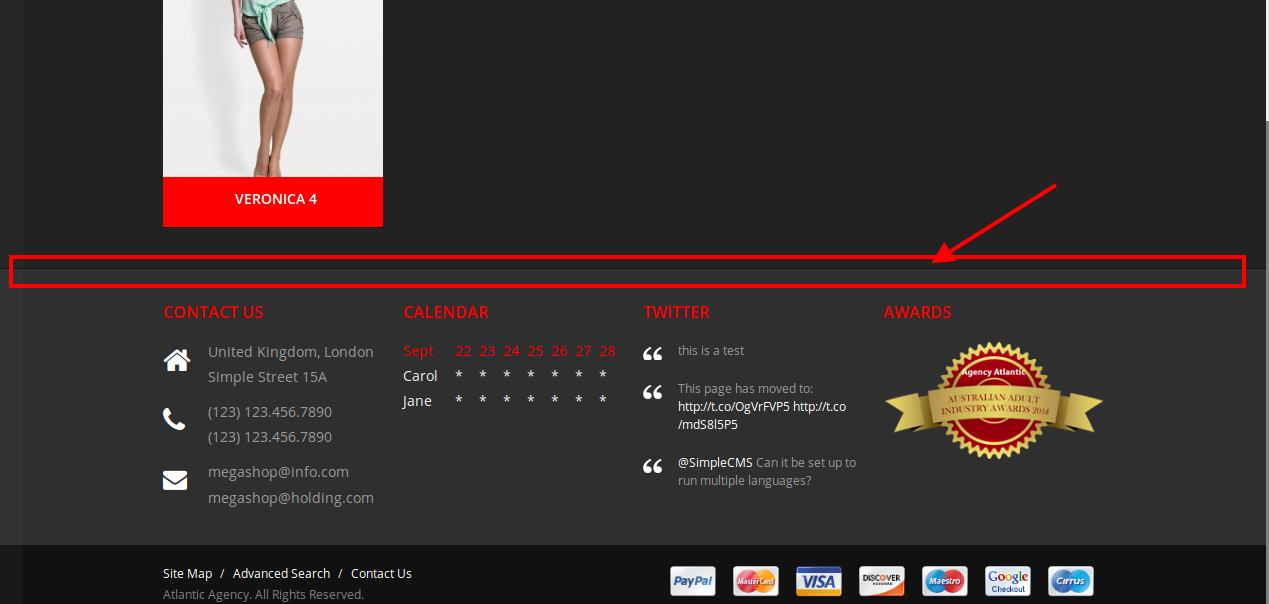
    ON this page – http://mantravisual.com/atlantic/?post_type=product – I have reduced the margin space underneath the products but how do I remove that black line that is appearing in the footer (which is part of the products div)

    thanks for all your help so far!

    7 Answers
    Avatar: Eva
    Eva Kemp
    Support staff
    September 25, 2014 at 15:56

    Hello,

    To change color for table borders add this code into custom.css file:

    .table td {
        border-top: 1px solid #ff0000 !important;
    }

    Could you please show on a screenshot what exactly you wan to remove on the page http://mantravisual.com/atlantic/?product=brook-jameson ?

    To remove a black line use this code:

    .page-title {
     border-bottom: none !important;
    }

    Please provide us with wp-admin panel credentials to check the text columns. Also this page http://mantravisual.com/atlantic/?page_id=372 doesn’t have any text to be able to compare.

    Concerning the menu use this code:

    .menu > ul > li > a {
        color: pink;
    }
    .menu > ul > li > a:hover {
    color: pink !important;
    border-bottom-color: pink !important;
    }

    The code to remove the line in footer is:

    .grid_pagination_bottom_block {
        border-bottom: none !important;
    }

    Regards,
    Eva Kemp.

    Avatar: smoothbob
    smoothbob
    Participant
    September 26, 2014 at 11:50

    Hi

    re the columns: you can see the text box width better on this page: http://mantravisual.com/atlantic/?page_id=124 – site login provided.

    I am still getting some pink in the menu: the 2 lines and the text – http://mantravisual.com/atlantic/menu.jpg

    re: .grid_pagination_bottom_block { border-bottom: none !important;}- I am still getting that line appear in the footer – only on that page: http://mantravisual.com/atlantic/?post_type=product

    and the items I’m trying to remove: http://mantravisual.com/atlantic/page.jpg

    thanks again

    Please, contact administrator
    for this information.
    Avatar: Eva
    Eva Kemp
    Support staff
    September 26, 2014 at 15:57

    Hello,

    I’ve added the following code into custom.css file to fix the menu colors:

    .menu > ul > li ul {
        border-color: red !important;
    }
    
    .default-menu > ul > li > ul > li a:hover { color: red !important; }

    Sorry, but I don’t see the line in the footer. Do you want to remove this line?

    To make the block wider for About page you need remove “div” code in the text editor:

    To remove product meta add this code in custom.css:

    div.product_meta span {
        display: none !important;
    }
    .entry-title {
        border-bottom: none !important;
     }
    hr {
        border-bottom: none !important;
        border-top: none !important;
    }

    Regards,
    Eva Kemp.

    Avatar: smoothbob
    smoothbob
    Participant
    September 29, 2014 at 10:37

    Hi

    thanks for that, all great except the columns thing, sorry what I meant was I want the columns to stay but the width of the 2 cols is not as wide as a single block so there is a space before the sidebar, I would like the 2 col grid to be a bit wider basically

    thanks again

    Avatar: Eva
    Eva Kemp
    Support staff
    September 29, 2014 at 15:31

    Hello,

    I’ve added the following code to custom.css file:

    .row .columns-row .span4 {
        width: 340px !important;
    }

    Please check the post now.

    Regards,
    Eva Kemp.

    Avatar: smoothbob
    smoothbob
    Participant
    September 29, 2014 at 18:40

    Hi

    thanks

    but what I am trying to do is this; http://www.mantravisual.com/atlantic/columns.jpg

    I want to make that whole block wider with less space next to the right sidebar

    thanks again

    Avatar: Eva
    Eva Kemp
    Support staff
    September 29, 2014 at 20:02

    Hello,

    Sorry, but there is no possibility to make it wider. I’ve set the width back to 340px.

    Regards,
    Eva Kemp.

  • Viewing 8 results - 1 through 8 (of 8 total)

The issue related to '‘A few more tweaks’' has been successfully resolved, and the topic is now closed for further responses

8theme customization service
We're using our own and third-party cookies to improve your experience and our website. Keep on browsing to accept our cookie policy.