Assistance Needed for Picture Display Size on Website

This topic has 6 replies, 2 voices, and was last updated 3 months ago ago by Luca Rossi

  • Avatar: Bagwani
    Bagwani
    Participant
    July 11, 2024 at 09:28

    Hi Team,

    I hope this email finds you well.

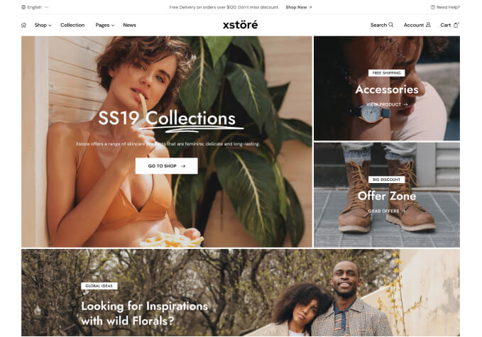
    I would like to address an issue I’m facing with the display of pictures on my shop page. Currently, the pictures are responsive and look good on both phones and laptops. However, on the laptop version, there are additional sections such as text, heading, buttons, and side images, which I don’t want.

    All I need is to have the pictures displayed in the same size as they currently appear on the main page, both on laptops and phones, without any additional sections. When I remove these sections, the size of the pictures gets distorted. Could you please help me with the correct size needed to ensure the pictures are set properly in both mobile and laptop sizes without any sections or text?

    ????: ? ???? ??? ???? ?? ?? ??? ???? ?? ?? ?? ????????? ????????? ?? ??? ??????. ???? ???? ?? ???????, ?? ?????? ???? ?? ???? ????.

    Thank you for your assistance.

    Best regards,
    Bagwani

    Files is visible for topic creator and
    support staff only.
    5 Answers
    Avatar: Justin
    Luca Rossi
    Support staff
    July 12, 2024 at 11:03

    Dear Bagwani,

    We hope this message finds you well. We are currently experiencing difficulty accessing your website via the following link: https://prnt.sc/ZizJHvtbJUSr

    Could you kindly verify the status of the website at your earliest convenience?

    Thank you for your attention to this matter.

    Best regards,
    8Theme’s Team

    Avatar: Bagwani
    Bagwani
    Participant
    July 12, 2024 at 12:23

    Dear Team,

    please check problem is resolved now.

    The website is live now.

    Avatar: Justin
    Luca Rossi
    Support staff
    July 13, 2024 at 08:20

    Hi @Bagwani,

    The height and width of the shop page section on mobile are too different from the desktop, so you can’t use the same size of desktop for mobile.

    Solution is creating another background image with 4:3 ratio for the mobile version: https://prnt.sc/vgB4mg8fmx1f

    For more information, please take a look at this article: https://www.cronyxdigital.com/blog/hero-image-sizing-guide-for-desktop-mobile.

    Best regards,
    8Theme’s Team

    Avatar: Bagwani
    Bagwani
    Participant
    July 13, 2024 at 09:35

    Ok. I understand but the point is,
    the current image has so many sections that’s why the size looks good, and whenever I remove a section it scratches and the size does not look good.

    So please help me with the desktop size too. I will create both images separately for sure.

    Thank you
    BAGWANI

    Avatar: Justin
    Luca Rossi
    Support staff
    July 13, 2024 at 15:52

    Dear @Bagwani,

    We hope this message finds you well. We would like to inform you that there is no specific size requirement for desktop backgrounds as the sizing utilizes a cover style. This means that the background width adjusts based on the browser width.

    Therefore, any image with a 16:9 aspect ratio will be suitable.

    Best regards,
    The 8Theme Team

  • Viewing 6 results - 1 through 6 (of 6 total)

You must be logged in to reply to this topic.Log in/Sign up

8theme customization service
We're using our own and third-party cookies to improve your experience and our website. Keep on browsing to accept our cookie policy.