This topic has 6 replies, 3 voices, and was last updated 6 months ago ago by Luca Rossi
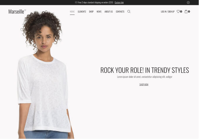
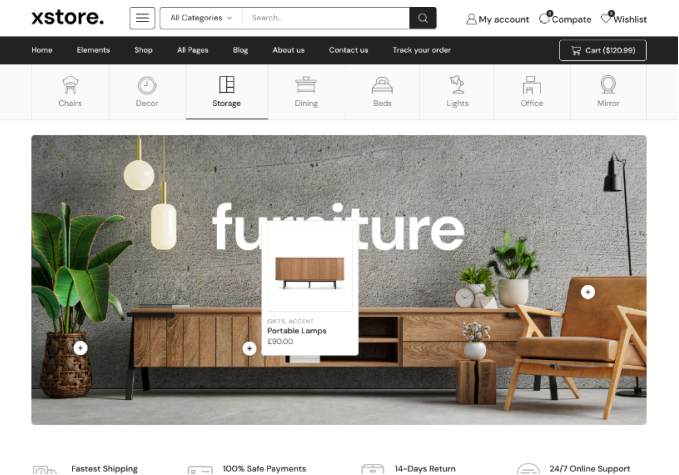
Hello! I’m working on the hero section for my site and when I first load the site, I have 3 banners but they are slightly below the hero section. Almost like something is blocking them at the tip. When you scroll just a tad, they then appear in the center and how they ‘should’ look but it’s a wonky UX as it scrolls to align them really quickly.
Hello, @MarkChatters,
Thank you so much for purchasing our theme and contacting our support center.
To assist you more effectively, we kindly request the following:
1. **Video Documentation**: Please capture a video illustrating the issue you are encountering for a clearer understanding. You may upload the video to a file-sharing service such as [WeTransfer](https://wetransfer.com/) and share the URL with us.
2. **Detailed Description of the Issue**: We find your initial request somewhat unclear. Could you please provide a more detailed description of the problem or specify your desired outcome? This will enable us to address your concerns more accurately.
Additionally, for us to investigate this matter thoroughly, please provide your site’s WordPress Admin credentials in the private content area of this topic:
– **WP Admin URL**:
– **WP Admin Username**:
– **WP Admin Password**:
**Important**: Ensure you have a complete backup of your site before providing the above details.
Thank you for your cooperation. We look forward to resolving your issue promptly.
Best Regards,
The 8Theme Team
I’ve attached a screen recording of the issue too. It is faint to see but essentially, about halfway through the video is how it should look. If you notice, when you first load it, the banners are outside the vh (which is okay, I like the look) but when you go to do the first scroll down, it’s really fast to align it in the center (which is how it looks in elementor) almost like it’s being forced to be at the correct position.
Essentially:
– Load up site
– Notice 3 side by side banners are a little outside the vh
– Scroll down
– notice how fast it scrolls – almost feels a tad unnatural or forced.
– How it is in elementor is how it should be.
Dear Mark,
We hope this message finds you well. We are reaching out to share a visual representation of the three columns as they currently appear on our end. Unfortunately, we are still unable to identify the issue you mentioned.
Could you please provide us with more details or clarify the specific problem you are encountering? This would greatly assist us in understanding and addressing your concerns more effectively.
For your reference, here is the link to the screenshot we have taken: [https://www.awesomescreenshot.com/video/28875232?key=18a040e344b9ea40af4e4f9ae92d769e](https://www.awesomescreenshot.com/video/28875232?key=18a040e344b9ea40af4e4f9ae92d769e)
We appreciate your cooperation and look forward to your prompt response.
Best regards,
8Theme’s Team
Hello! Thanks for the reply. So when it first loads and then you do your first scroll down, does it seem like it moves extremely fast? Almost like the banners snap into place very quickly and change position depending on first load vs first scroll if that makes sense? At least that’s what’s happening to me. It is something minor but is the first experience.
Hopefully this clears it up:
Basically notice how, when you first load in, the banner columns are much lower. But, after you scroll down, then scroll all the way up again, they are higher then they originally were on first load. Seems like fixing that issue will fix the main one (which I’m sorry is hard to explain!) 🙂
Hope that helps!
Hi @MarkChatters,
We’ve exported your home page template and imported to our local sites but it’s working fine without any spacing issues.
In this case, could you please help us to convert all the sections in your home page to container instead?
https://elementor.com/help/convert-existing-sections-to-containers/
Let us know how it goes!
You must be logged in to reply to this topic.Log in/Sign up