Category page thumbnails not aligning properly in their rows

This topic has 34 replies, 3 voices, and was last updated 10 years, 5 months ago ago by Eva Kemp

  • Avatar: kcoulter
    kcoulter
    Participant
    June 3, 2014 at 17:34

    Hi. All’s shaping up in the theme, but there seems to be an issue with the category page thumbnails not aligning properly, as the product thumbnails images already do. I would also really like to style up my category level thumbs to look like the product thumbs but having issues there too.

    dev site is http://www.allardofficefurniture.co.uk

    The problem is on a few pages example: http://allardofficefurniture.co.uk/product-category/seating/

    should come in more like : http://allardofficefurniture.co.uk/product-category/seating/operatortask-chairs/

    (obviously ignoring the different size chair thumbs at this stage)

    Help please, driving me insane!!!

    Please, contact administrator
    for this information.
    33 Answers
    Avatar: Eva
    Eva Kemp
    Support staff
    June 3, 2014 at 19:29

    Hello,

    Try to add this code into custom.css file:

    .category-block img {
        height: 200px;
    }

    To create custom.css you can rename default.custom.css to custom.css in the theme wp-content/themes/xmarket and enable it in XMarket – Theme Settings > tick “Enable Custom CSS file”.

    Regards,
    Eva Kemp.

    Avatar: kcoulter
    kcoulter
    Participant
    June 4, 2014 at 11:39

    Thanks Eva

    I had a play and added to height: 200px to .category-block instead, as on .img it stretched the images. I would ideally like to style up the category thumbnails to look same as the product thumbnails (minus the price) but am getting in a muddle.

    Also very importantly, on top level categories (Desks, Tables, Chairs, Storage etc) I need to show an intro paragraph for each. I can place this text in Product Categories but how do I display on the page please?

    Regards
    Kevin

    Avatar: Jack Richardson
    Jack Richardson
    Support staff
    June 4, 2014 at 13:37

    Hello,

    Please provide us with FTP and wp-admin credentials in Private Content.

    Regards,
    Jack Richardson

    Avatar: kcoulter
    kcoulter
    Participant
    June 4, 2014 at 16:44

    Hi Jack. Thanks

    WP admin access below but can’t currently find my password for ftp. Will keep looking but you may not need ftp access . Let me know if there’s a problem

    Many thanks in advance

    Kevin

    Please, contact administrator
    for this information.
    Avatar: Jack Richardson
    Jack Richardson
    Support staff
    June 5, 2014 at 08:29

    Hello,

    We’ve added code for category description display. Check it now, please!

    Regards,
    Jack Richardson

    Avatar: kcoulter
    kcoulter
    Participant
    June 5, 2014 at 09:21

    That’s brilliant. Thank you. If it’s straightforward, please let me know what it was so I know this for future. The less I can bug you guys at support the better all round! I also want the Category title to appear. Again, if it’s simple enough just tell me and I’ll add. I take it I can just add a class and style this baby up however I want to? (place in a box or whatlike?)

    Regards
    Kevin

    Avatar: Jack Richardson
    Jack Richardson
    Support staff
    June 5, 2014 at 09:50

    Hello,

    We’ve added following code <?php do_action( 'woocommerce_archive_description' ); ?> into /woocommerce/archive-product.php.

    Also we’ve added this code to display category title:

    <?php if ( apply_filters( 'woocommerce_show_page_title', true ) ) : ?>
    <h1 class="title"><span><?php woocommerce_page_title(); ?></span></h1>
    <?php endif; ?>

    Regards,
    Jack Richardson

    Avatar: kcoulter
    kcoulter
    Participant
    June 5, 2014 at 10:05

    That’s fantastic. Thanks so much. I’ve been using wordpress for a while now and still find it difficult to identify where code goes. I’m a graphic designer and a poor coder but always try and use my initiative (normally costing me more time than I have). Great to know your support is spot on!

    Thanks Jack 🙂

    Avatar: Jack Richardson
    Jack Richardson
    Support staff
    June 5, 2014 at 10:12

    Hello,

    You are welcome.
    We are always happy to help!

    Regards,
    Jack Richardson

    Avatar: kcoulter
    kcoulter
    Participant
    June 5, 2014 at 10:15

    I’ve just started testing reviews out and added a couple of Stars to some products.

    They stars are dropping in top right over text in product listing pages – http://allardofficefurniture.co.uk/product-category/seating/operatortask-chairs/

    They need to be well out of the way anything (maybe bottom right or under price). Had a quick look at CSS but could not fix this. Pls could you take a look for me.

    Avatar: Eva
    Eva Kemp
    Support staff
    June 5, 2014 at 11:36

    Hello,

    I’ve placed star-rating icon under the price of a product.
    Please check if it’s fine.
    You can see the changes made in custom.css file in Appearance > Editor.

    Regards,
    Eva Kemp.

    Avatar: kcoulter
    kcoulter
    Participant
    June 5, 2014 at 12:05

    That’s wonderful.. Looks great there. Thanks. One last thing today (I hope)

    OK, last thing for now. On the product listings page, eg. http://allardofficefurniture.co.uk/product-category/seating/operatortask-chairs/ (images with white backgrounds)

    or

    http://allardofficefurniture.co.uk/product-category/storage/wooden-storage/bookcases/

    the thumbnails come in at different dimensions, but all aligns because the product info box holds all in place.

    I need this for all the category display pages! At the moment, when I add the Category images in the backend under Product Categories, I have little/no control of how that image is pulled in. I’m not sure what needs to happen here, but I would like same styling on category lists as on product list. If this is far too complicated, I will have to create set size thumbs for all category level images (but would still love there to be a funky box styled around the title and maybe a button as the product list pages) .

    I know this is probably a challenge. I’ve tried to solve myself, believe me 🙂

    I’m very happy with rest of theme, by the way. Can’t foresee anything more complicated than this problem hereon in!

    Avatar: Eva
    Eva Kemp
    Support staff
    June 5, 2014 at 12:18

    You’re welcome.
    I’ve modified custom.css file.
    Please check if everything is ok.

    Regards,
    Eva Kemp.

    Avatar: kcoulter
    kcoulter
    Participant
    June 5, 2014 at 12:33

    sorry, that’s not really what I was after. It’s not a case of adding extra space under bits on the products listings page. Was pretty happy with products listings page as it stood. Please re-read above – it’s the top level category page which needs styling to match. Then some kind of control over how category level thumbnails are displayed (product thumbnails seem to generally work ok already)

    Avatar: Eva
    Eva Kemp
    Support staff
    June 5, 2014 at 13:34

    Sorry for misunderstanding.
    As I see there is the same styling on category lists and on product list.
    Could you please clarify with more details how you want the products to be shown?
    Thank you.

    Regards,
    Eva Kemp.

    Avatar: kcoulter
    kcoulter
    Participant
    June 5, 2014 at 13:56

    First, don’t apologise. I don’t make things the clearest at the best of times 🙂

    If the category list page/info could look more like the product list info http://allardofficefurniture.co.uk/product-category/seating/operatortask-chairs/

    but obviously no price range or stars, (and maybe CLICK HERE or SHOP HERE in button)

    You’ll see I’ve been in and styled the intro text already so I know a little bit here and there.

    Because the site is sooooo diverse with images, it’s difficult to control height of thumbs, but the box on the product lists keeps things in line much better than the category lists!

    Avatar: Eva
    Eva Kemp
    Support staff
    June 5, 2014 at 14:46

    As I understood you correctly you want to add some button in category lists and have the same border box for categories title, don’t you?
    Unfortunately it requires additional customization and is a paid service. Sorry, but our specialists are unable to assist clients on additional customization due to much amount of work.

    Please take our apologies.

    Regards,
    Eva Kemp.

    Avatar: kcoulter
    kcoulter
    Participant
    June 6, 2014 at 11:43

    It’s ok, I’ve sorted myself – http://allardofficefurniture.co.uk/product-category/desks/

    Shaping up.

    OK, next… starting on some basic info pages – http://allardofficefurniture.co.uk/free-services/?preview=true&preview_id=9272&preview_nonce=383f0bd66e

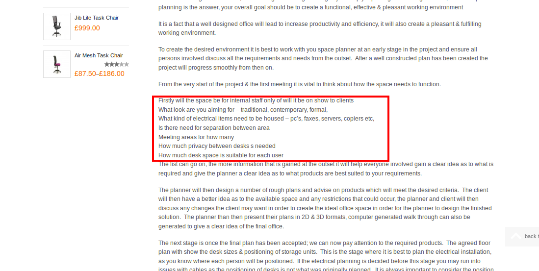
    All the ul and li isn’t working on here. I’ve tried to identify and force it in custom.css but it’s still not working. Can you fix this issue please as the theme should have working layout for lists:

    ul.content.simple-page {
    list-style-type: none;
    padding: 0px;
    margin: 0px; !important
    }

    ul li.content.simple-page{
    background-image: url(obullet.gif);
    background-repeat: no-repeat;
    background-position: 0px 5px;
    padding-left: 14px; !important
    }

    (I’ve added an obullet.gif in images if that helps)

    thanks
    Kevin

    Please, contact administrator
    for this information.
    Avatar: Eva
    Eva Kemp
    Support staff
    June 6, 2014 at 11:50

    Hello,

    I am unable to access this page http://allardofficefurniture.co.uk/free-services/?preview=true&preview_id=9272&preview_nonce=383f0bd66e getting an error “You do not have permission to preview drafts.”
    Please check it.

    Regards,
    Eva Kemp.

    Avatar: kcoulter
    kcoulter
    Participant
    June 6, 2014 at 11:55
    Avatar: Eva
    Eva Kemp
    Support staff
    June 6, 2014 at 12:06

    Sorry, but it’s a bit unclear what you’re trying to achieve. Could you please specify what exactly you want to change on this page http://allardofficefurniture.co.uk/free-services/ ?
    Thank you.

    Regards,
    Eva Kemp.

    Avatar: kcoulter
    kcoulter
    Participant
    June 6, 2014 at 12:09

    this page is probably a better example:

    http://allardofficefurniture.co.uk/office-planning-service/

    should have lists formatting properly

    Avatar: kcoulter
    kcoulter
    Participant
    June 6, 2014 at 12:10

    the ul li doesnt work even though I’ve tried to force it in custom.css

    even if you fix it with the standard bullet point, as even that wasnt appearing. As long as you tell me where you made the change, I can sort more complex later

    Avatar: Eva
    Eva Kemp
    Support staff
    June 6, 2014 at 12:33

    Do you want bullets to be shown for the list of this area?

    Or do you want to create bullets listing for the whole content?
    We appreciate if you clarify your requests with more details. Even you can show in screenshots what you’re trying to do.
    Thank you.

    Regards,
    Eva Kemp.

    Avatar: kcoulter
    kcoulter
    Participant
    June 6, 2014 at 15:02

    if you look at this page in the backend, you’ll see the section which is an unordered list. Just this bit, as it should be please

    http://allardofficefurniture.co.uk/office-planning-service/

    Avatar: kcoulter
    kcoulter
    Participant
    June 6, 2014 at 15:03

    Yes. Just where the ul li should work throughout

    Avatar: Eva
    Eva Kemp
    Support staff
    June 6, 2014 at 16:03

    Hello,

    Please check the page http://allardofficefurniture.co.uk/office-planning-service/
    Is that what you were trying to do?

    Regards,
    Eva Kemp.

    Avatar: kcoulter
    kcoulter
    Participant
    June 6, 2014 at 16:08

    Yes, thanks. Now, where can I go in an tweak this css. Not in custom.css I know 🙂

    Avatar: Eva
    Eva Kemp
    Support staff
    June 6, 2014 at 16:10

    You can check it in custom.css file. I’ve modified your code a little.

    Regards,
    Eva Kemp.

  • 1 2
    Viewing 30 results - 1 through 30 (of 34 total)

The issue related to '‘Category page thumbnails not aligning properly in their rows’' has been successfully resolved, and the topic is now closed for further responses

8theme customization service
We're using our own and third-party cookies to improve your experience and our website. Keep on browsing to accept our cookie policy.