This topic has 8 replies, 3 voices, and was last updated 8 years, 7 months ago ago by Eva Kemp
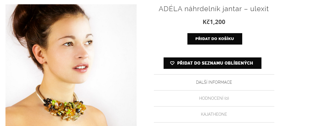
Hi there, could you please help me with customization of the right side of product page information …the add to card, add to wishlist the name of product all that right panel in center..centered rather pulled to the left ?
Thank you very very much
Iva 🙂
Hello,
Try to use this code in Custom CSS for desktop section:
.product-information {
text-align: center;
margin-left: 30px;
width: 450px;
}
.product-information .cart button[type="submit"] {
margin-left: 28%;
}
Regards,
Eva Kemp.
Thank you on desktop is ok but on mobile is too wide , could you help me to fix it and also I’m trying to center this custom variation on this product http://kajatheone.com/shop/eleonora-broz/, please.
Thank you very much
Iva
Hello,
Please also add this code in Custom CSS for desktop:
.product-information table.variations {
margin-left: 21%;
}
As for mobile you need remove the code in Global Custom CSS section and add it to Custom CSS for desktop section as I told you:
.product-information {
text-align: center;
margin-left: 30px;
width: 450px;
}
.product-information .cart button[type="submit"] {
margin-left: 28%;
}
Regards,
Eva Kemp.
Hiya ! thank you very much…could you please also help me with the wishlist icon on images suddenly it has black mark on it instead of heart ..? Dont understand why…
Thank you
Iva :))
Hello ivava,
we have checked your site and Wishlist icon is displayed this way:
Please show on screenshot what results do you want to achieve.
Regards,
Stan Russell.
Yes Hi :))
Sorry is this one http://kajatheone.com/wp-content/uploads/2016/04/Screen-Shot-2016-04-30-at-14.07.50.png
Thank you!
Hello,
Icon is shown this way now:
http://storage2.static.itmages.com/i/16/0503/h_1462259991_7822037_b7079c8ebc.jpeg
Try to clear browser cache and check again.
Regards,
Eva Kemp.
You must be logged in to reply to this topic.Log in/Sign up