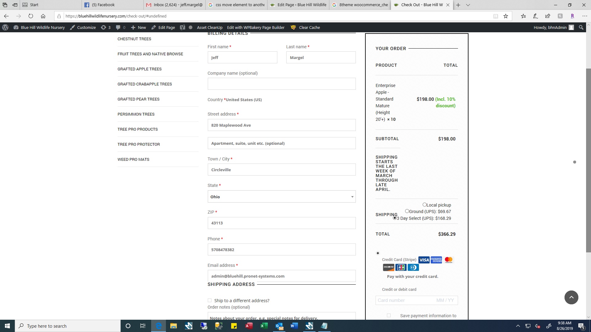
Attached is a screenshot of my checkout page. Notice how everything is not aligned? Such as the credit card (stripe) How can I fix this?

This topic has 7 replies, 2 voices, and was last updated 6 years, 3 months ago ago by Olga Barlow
Attached is a screenshot of my checkout page. Notice how everything is not aligned? Such as the credit card (stripe) How can I fix this?

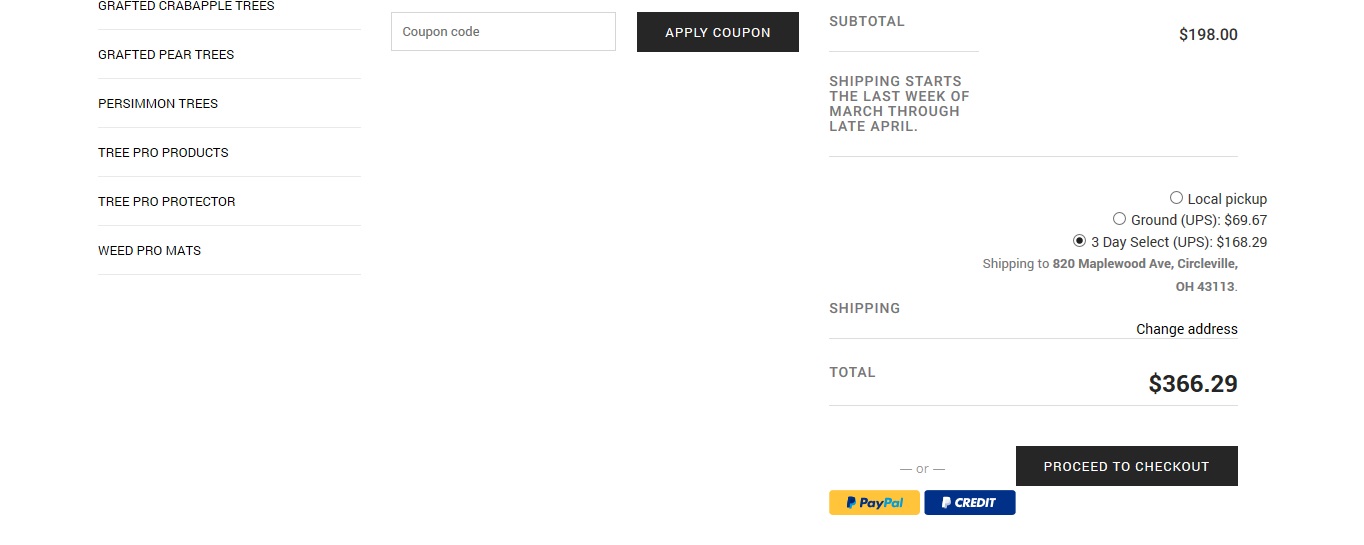
Also on the cart page, notice the paypal buttons. Any possible way to get them underneath the proceed to checkout button?

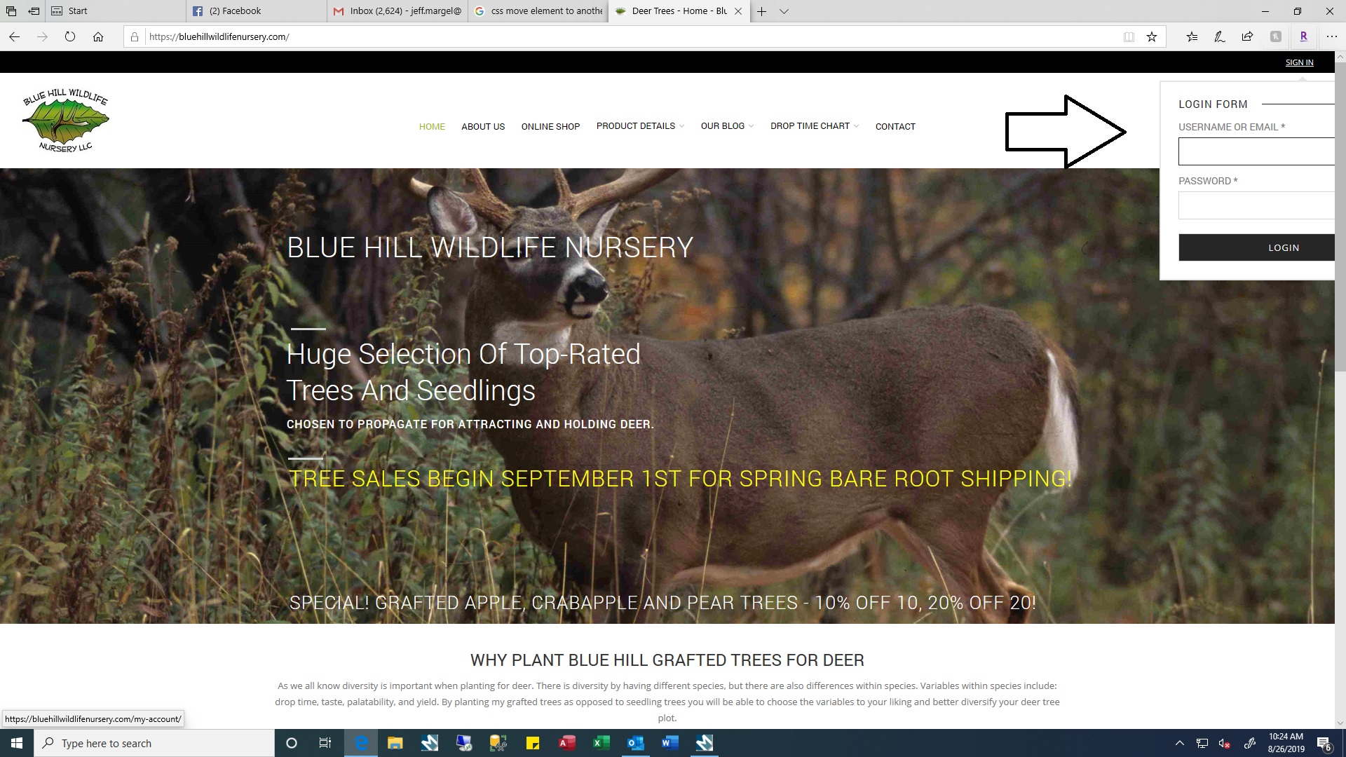
And one more.. Notice the sign in form way off to the right. Any possible way to bring that over to the left or better yet remove the black bar and have the sign in on the menu?

Could I please get a reply to my issue? I saw in your theme options there is an option to turn off the top bar, however that doesn’t seem to work when I switched it to off.
Hello,
We have fixed the login form and proceed to checkout button on the cart page. Let me know what exactly do you want to change in the Stripe styles http://prntscr.com/oy8ha0 ?
Regards
When you are in page edit mode, the checkout page looks good. However outside of page edit mode it looks like my screenshot.
Hello,
I see the following styles if visit your checkout page https://prnt.sc/oy8ha0 without any edit mode.
Clear the browser cache https://chrome.google.com/webstore/detail/clear-cache/cppjkneekbjaeellbfkmgnhonkkjfpdn?hl=en
Tell me what exactly do you want to change? Provide screenshot/mockup how your checkout page should be for better understanding.
Regards
You must be logged in to reply to this topic.Log in/Sign up
