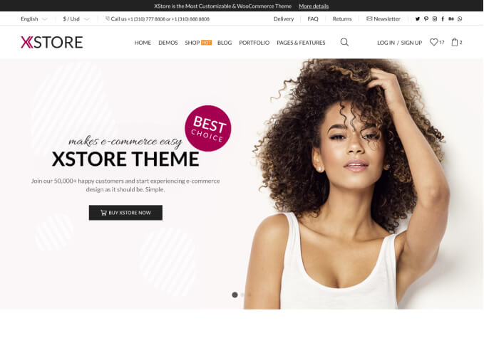
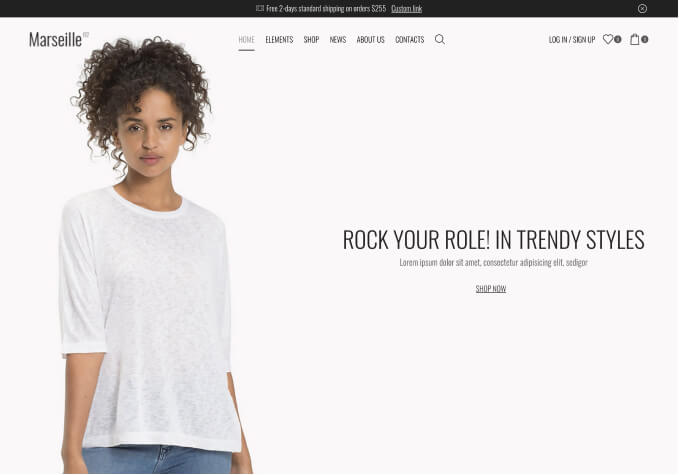
Hello! I’m trying to have different mobile and desktop headers. They are distinctly different in the Xstore header builder, but when I actually publish them, they are either 1 or the other.
Example, if Iw as last editing my desktop header, publish it, the desktop header will appear on both mobile and desktop. If I was last editing my mobile header then publish it, the mobile header appears on both desktop and mobile. It seems to be whichever one I last published even though they are distinctly different in the builder.
If you go to the site on mobile then on desktop you can see. It seems like just in general, the site isn’t respecting whether the header is mobile or desktop and just chooses one as it pleases.
I got it to work a while ago, and without touching it, it seems to revert itself all the time. It’s a tad frustrating so any help would be awesome 🙂


