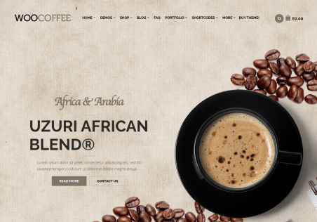
Desktop vs Mobile Text - by aahmadi3 - on WordPress WooCommerce support

This topic has 2 replies, 2 voices, and was last updated 6 years, 1 months ago ago by Rose Tyler

  • Avatar: aahmadi3
    aahmadi3
    Participant
    October 10, 2018 at 17:11

    Hello,
    Can we change the layout of headlines and text on desktop vs mobile devices?
    For example the breaks and spaces we are using on desktop are falling in the wrong places on mobile devices because the screen is smaller. How do we work around this to make our site more presentable?
    Please advise.
    Thanks
    Ali

    1 Answer
    Avatar: Rose Tyler
    Rose Tyler
    Support staff
    October 11, 2018 at 08:07

    Hello,

    Please check documentation of WPBakery Page Builder https://wpbakery.com/video-academy/category/responsive/ https://kb.wpbakery.com/docs/learning-more/responsive-settings/
    Also, you can change styling of elements on different devices using custom css code.
    Feel free to ask if you have any other questions.

    Regards

  • Viewing 2 results - 1 through 2 (of 2 total)

You must be logged in to reply to this topic.Log in/Sign up

8theme customization service
We're using our own and third-party cookies to improve your experience and our website. Keep on browsing to accept our cookie policy.