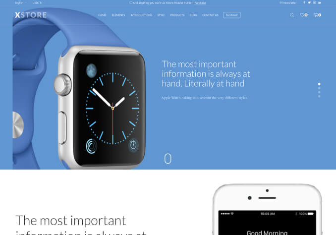
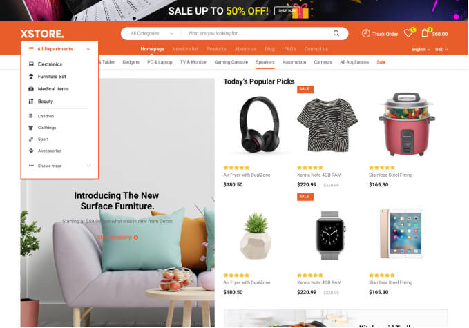
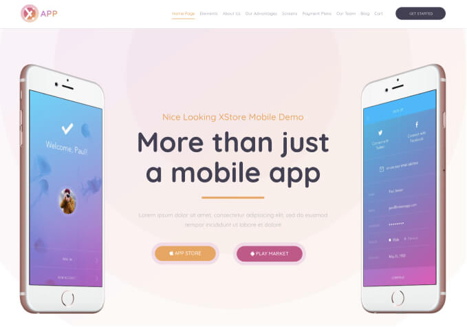
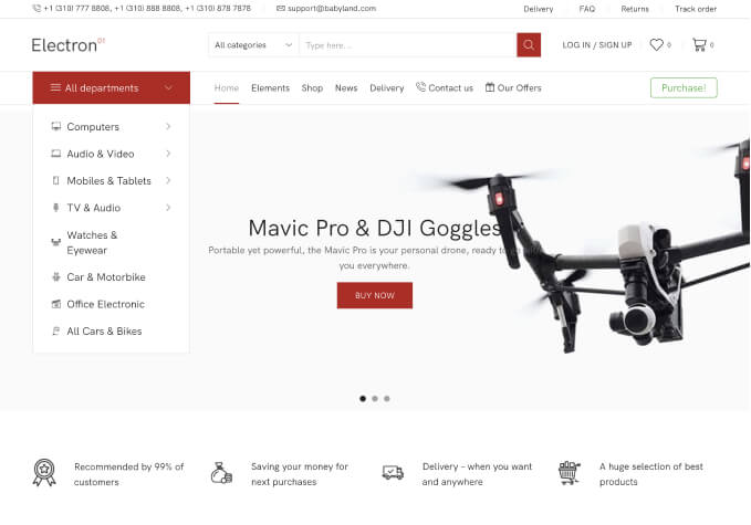
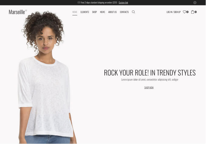
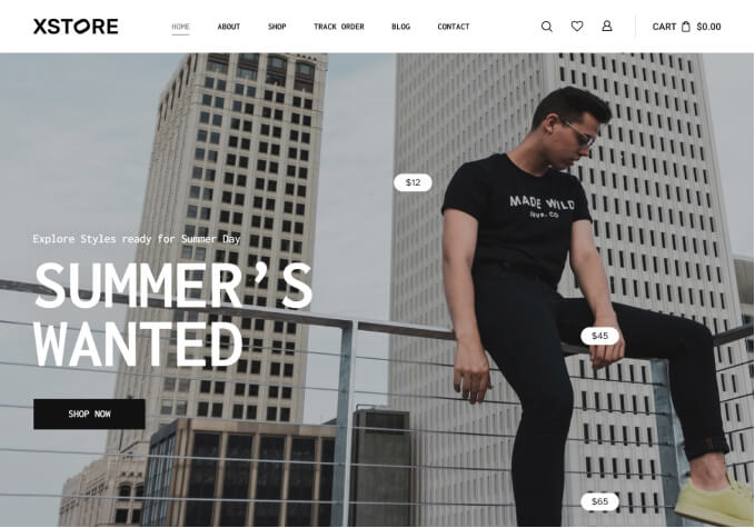
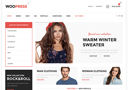
Different look of the store (mainly header and footer) on desktop in mobile view vs. phone

This topic has 2 replies, 2 voices, and was last updated 2 hours, 51 minutes ago ago by Tony Rodriguez

  • Avatar: Stelma
    Stelma
    Participant
    September 30, 2024 at 09:44

    Hi,
    I have a problem, I set the mobile view of the store on the computer and everything displays as it should, but when I run the page on the phone, something completely different is displayed.
    I am sending the view from the computer and from the mobile in the attachment.

    I also have a problem with the header falling apart in the mobile view, but first I want to solve the problem of displaying the page.

    Best regards,
    Stelma

    Regards,
    Stelma

    Content is visible for topic creator and
    support staff only.
    Files is visible for topic creator and
    support staff only.
    1 Answer
    Avatar: Tony Rodriguez
    Tony Rodriguez
    Support staff
    September 30, 2024 at 09:50

    Hello, @Stelma,

    Thank you for contacting us and for using XStore.

    We kindly request that you navigate to the Dashboard, proceed to the “Plugins” section, and disable the “XStore AMP” plugin and check again.

    https://xstore.helpscoutdocs.com/article/111-general-info-amp

    We hope this helps. Should you require any further assistance, please do not hesitate to reach out. We are here to help you.

    Please note that always create new topics for new issues on our support forum to avoid any inconvenience and get prompt assistance.

    Warm Regards,
    The 8Theme Team

  • Viewing 2 results - 1 through 2 (of 2 total)

You must be logged in to reply to this topic.Log in/Sign up

8theme customization service
We're using our own and third-party cookies to improve your experience and our website. Keep on browsing to accept our cookie policy.