This topic has 14 replies, 3 voices, and was last updated 8 years, 5 months ago ago by Eva Kemp
Hello!
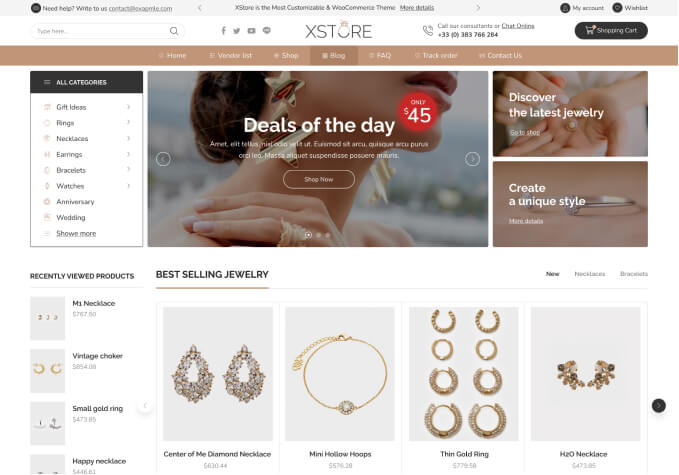
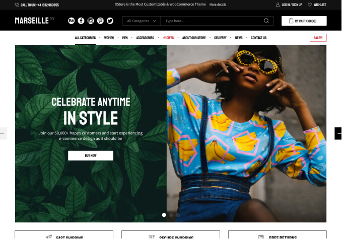
I cannot find the css that determines the size of the header logo and menu padding for screen sizes 1000-1200px. I have found the css that determines that for screens larger than 1200px.
I would like to get the first image to look like the second image as much as possible. Thank you!
1000-1200px:
1201px +:
Hello,
If you want to decrease logo image size add this code in Custom CSS for desktop section:
.header-logo img {
max-width: 150px;
}
Best regards,
Jack Richardson.
I do have that in my child theme’s stylesheet:
.header-logo img {
max-width: 200px;
float: left;
}
The logo still reverts to a larger size (250px) when the screen is 1000-1200px wide, however. It also has different padding for this screen size.
Hello,
Please try that code in Global Custom CSS section.
Regards,
Eva Kemp.
Perfect! Thank you. Do you suggest I place all changes in the Global CSS instead of the child theme’s stylesheet?
Hello,
You can use either Global Custom CSS or child style.css file. You won’t lose changes with both methods after theme update. If you created child theme you can make all style modifications in child style.css file.
Regards,
Eva Kemp.
Thanks! I have migrated my custom css to the theme options instead of the child theme stylesheet.
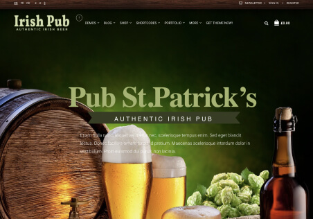
One last thing: How do I change the padding of the logo, search icon, and shopping bag icon when the container is 940px? It seems that everything I do in css works only when the container is 1140px wide (on larger screens).
When the container is 940px the logo, search icon, and shopping bag icon squeeze too close to the menu: The logo is 20px too far to the right. And the search and shopping bag icons are 40px too far to the left.
Hello,
Please show on a screenshot what you want to achieve.
Thank you.
Regards,
Eva Kemp.
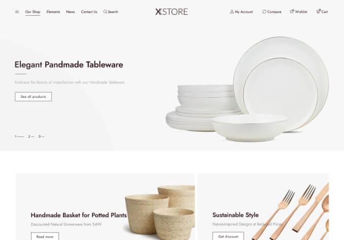
This is good! This logo and shopping cart do not have padding so they are flush with the edges of the 1140px-wide container.
Problem: Padding added when container is 940px
I want to make the 940px-wide container also have the logo and shopping cart have no padding.
Hello,
When I check the site in 940px screen size I see mobile header, not the desktop one like you showed.
Please view the screenshot http://prntscr.com/bsguh4
Do you want to remove padding there?
Regards,
Eva Kemp.
If you make the screen size 1100px wide the container will be 940px. I don’t mind the padding with the mobile header. Thanks!
Hello,
Please try to use this code in Custom CSS for desktop section:
.header-type-15 .main-header > .container {
padding-left: 15px;
padding-right: 0px;
}
.cart-bag {
padding: 12px 0px 0 !important;
}
Regards,
Eva Kemp.
That works, thank you so much! That is all I needed.
Hello,
You’re welcome.
Regards,
Eva Kemp.
Tagged: edit size, header logo, menu padding, seo friendly, templates, woocommerce, wordpress
The issue related to '‘Edit Medium Header Logo Size and Menu Padding’' has been successfully resolved, and the topic is now closed for further responses