This topic has 10 replies, 2 voices, and was last updated 10 months ago ago by Rose Tyler
Hi
I have found a bug in your code.
I have recorded a video for the same.
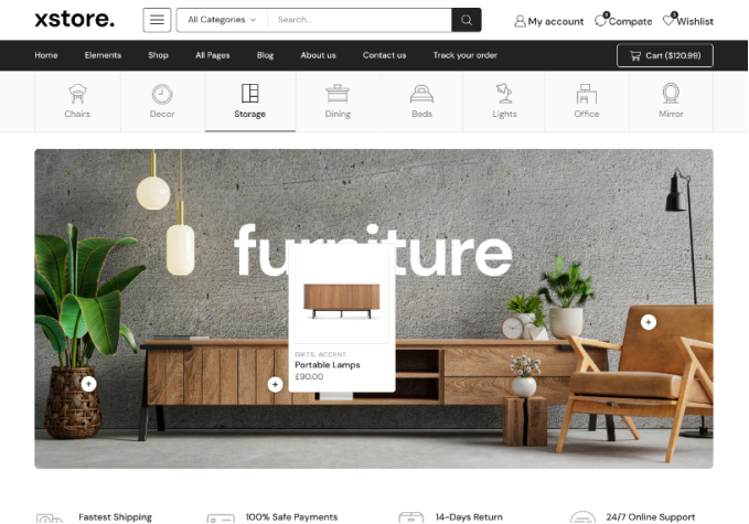
Problem is – full menu items do not appear on small size laptop screen. Full size (15 inch or bigger) laptop screen shows full menu (all menu items) but not the smaller screen size.
The last menu “Chocolates & Sweets” disappears on small size laptop. It appears when laptop screen size is bigger.
To make this simple and show you how it behaves, I am resizing my window screen from smaller to larger so you know how it behaves.
Please see the video
https://drive.google.com/file/d/1fgdWBHtjqXKQasaZPb3IYSCS0tHZu5J3/view?usp=sharing
Fix this bug please.
Thank you.
Hello,
Thank you for getting in touch with us.
We have reviewed the circumstances you have outlined and determined that they are the result of the following custom CSS code: https://prnt.sc/mjhtCpYSn6ub
Should you require any further assistance, please do not hesitate to contact us.
Best Regards,
8Theme’s Team
Hi
Please fix it if needed to make it correct. Its unfair to cut the text written on the website. It must show everything on all screen sizes right?
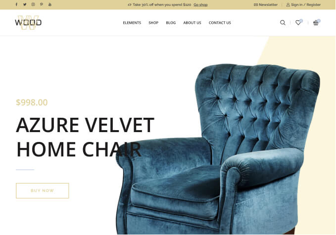
Even the horizontal bar does not show CONTACT US link (cuts texts horizontally too).
See attachments please.
Fix it if its OK to fix and does not disturb the other screen sizes.
Thank you.
Hello,
We are pleased to inform you that the issue has been resolved by removing the custom code as specified.
/* Menu responsive items */
@media only screen and (min-width: 1200px) and (max-width: 1275px) {
.et_element-top-level.et_b_header-menu .menu > li:last-child, .et_b_header-menu .menu > li:nth-last-child(2) .et_b_header-menu-sep {
display: none;
}
}
Best Regards,
8Theme’s Team
Thank you but could this trigger tablet screen resolution in smaller size laptops?
Because now when i see, it shows mobile layout!
Hello,
display: none; in the code just disable elements: .et_element-top-level.et_b_header-menu .menu > li:last-child, .et_b_header-menu .menu > li:nth-last-child(2) .et_b_header-menu-sep on screen size: (min-width: 1200px) and (max-width: 1275px)
If you want to change the “Starting Point Of The Mobile Header”, just go to Theme Options > General.
Best Regards,
8Theme’s Team
Sorry, thats too technical but i think now it starts mobile version in that size i mentioned. So if i will change starting point of the mobile, then again it may start cutting the text.
Isnt there any right solution for this?
Hello,
We regret to inform you that we find your request somewhat ambiguous.
Kindly proceed to test various values for the Starting Point of the Mobile Header by following this link: https://prnt.sc/pIGl_Uy1gLrw
We appreciate your cooperation.
Best Regards,
8Theme’s Team
So this means, resolution width 1200px or smaller than that; will have mobile layout?
1200px + will have laptop/desktop layout?
Hello,
Yes, the mobile layout for the header, and 1200px + will have laptop/desktop layout for the header.
Best Regards,
8Theme’s Team
Tagged: display issues, full menu, small laptop, templates, troubleshooting, woocommerce, wordpress
You must be logged in to reply to this topic.Log in/Sign up