Header - by Skawty - on WordPress WooCommerce support

This topic has 4 replies, 2 voices, and was last updated 9 years, 1 months ago ago by Eva Kemp

  • Avatar: Skawty
    Skawty
    Participant
    November 18, 2015 at 22:34

    Hi

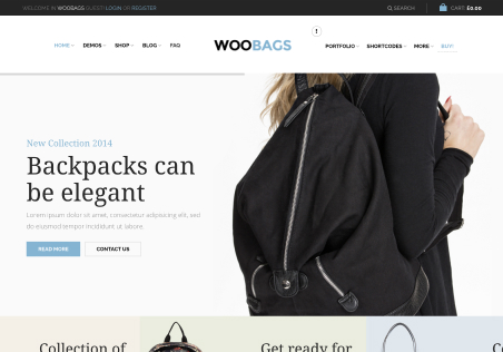
    I am Currently using header option #17 that has the split menus either side of the logo but for some reason when i am viewing via mobile device only the left side of the menu is available when i go into menus and set right side for mobile it sets that and disables the other side this crazy
    whats the point in having menus to pages that don’t show up on mobile devices ?

    Any help on this would be greatly appreciated.

    Kind Regards
    Scott

    3 Answers
    Avatar: Eva
    Eva Kemp
    Support staff
    November 19, 2015 at 09:09

    Hello,

    Please take our apologies but to show all items in mobile menu you should create a new menu and include all items you need, then select this menu as a mobile.

    Regards,
    Eva Kemp.

    Avatar: Skawty
    Skawty
    Participant
    November 19, 2015 at 10:59

    i created a new menu but for header 17 you have to make one either side don’t you? menu on the left and a menu on the right this is my issue.

    kind regards
    scott

    Avatar: Eva
    Eva Kemp
    Support staff
    November 19, 2015 at 15:51

    Hello,

    Sorry, but mobile menu can’t be set this way.
    It will show all menu items in one column.

    Regards,
    Eva Kemp.

  • Viewing 4 results - 1 through 4 (of 4 total)

You must be logged in to reply to this topic.Log in/Sign up

We're using our own and third-party cookies to improve your experience and our website. Keep on browsing to accept our cookie policy.