This topic has 8 replies, 2 voices, and was last updated 1 years, 11 months ago ago by Rose Tyler
Hi,
I know I have asked for help with this before, but I had to roll-back the site and so lost the inputs that you guys did for me (sorry!).
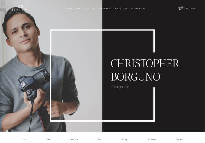
Just wondering if you’re able to help me get the homepage slider transparent again using the multiple headers option.
Please see private info for credentials and more info.
Thanks as always – promise I will back-up this time so I do not lose it again.
🙂
Hello,
Here you can set transparent for the header – https://prnt.sc/vlLWeMKKCw_5
We’ve edited the custom header, please clear the cache and check now.
Regards
Awesome thank you very much. Another query on the header please…
1. How do I set the same overlay / transparency for mobile / tablet layouts?
2. On the desktop custom header builder (default header) I have added a secondary menu element but when I swap view to tablet, there is no option for a secondary menu. How do I get the exact same layout on desktop & tablet (but not mobile)?
Here is menu that is desktop and shows the secondary menu -> https://i.imgur.com/Jl9tmSd.png
Here is tablet view and there is no widget to add for a secondary menu -> https://i.imgur.com/TOPHtYC.png
I want to swap the search bar with the menu on tablets (like the desktop view). But leave mobile menu as it is…
OR
is there a way to edit the breakpoint so that mobile menu only kicks in at 768px and below? I think it is currently set at 992px. Do you know the custom css to achieve this please or the setting?
3. Search results for pages is showing as ‘True Found’ – see private for an image showing this. Please advise how to fix.
4. On the breadcrumbs, on special pages such as my account & wishlist (uses different breadcrumb layout with an icon) – it shows the return to previous page link only on screens smaller than desktop. It is (correctly) hidden on desktops but not on tablet / mobile. How to do this please as it looks silly being on those two pages.
Thanks again
Hello,
Please post different questions via separate topics.
1/ Edit the header > Header overlap > enable overlap on mobile – https://prnt.sc/TWEE3009RHpY
2/ There is only desktop and mobile view, the tablet inherit settings from mobile for the header. You can change Mobile Header Starts From value via Theme Options > General.
3/ Provide FTP access, please. If you do not know how to create FTP contact with your hosting provider, they will help you.
4/ Please describe the desired result in more detail.
Regards
1. Thank you – understood now
2. Thanks – that’s a shame as would be ideal to have the standard 3 layout options…
3. See private info
4. I’ll come back to this / start a new thread later. Thank you.
Fixed. The fix will be included in the next update too.
Regards
Awesome thank you very much 🙂
You’re welcome!
Regards
Tagged: create, header, homepage, themes, transparent, woocommerce, wordpress
You must be logged in to reply to this topic.Log in/Sign up