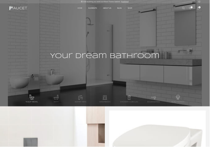
How can I configure distinct image dimensions for mobile devices and iPads within slideshows? While the theme endeavors to optimize image display dynamically, images appear excessively large on mobile and iPad screens, resulting in undesirable cutoffs. How can I direct the display to adjust to the appropriate image size for these devices, ensuring the images are fully visible without any cropping?