This topic has 3 replies, 2 voices, and was last updated 10 minutes ago ago by regencycigaremporium
Dear XStore Team,
I hope this message finds you well. First, let me express how much I appreciate the incredible flexibility and elegance of your theme—it’s truly a standout!
I’m reaching out to seek your guidance on a customization for our website. We’d like to display the categories spotlight section in a vertical layout instead of horizontal when viewed on mobile devices. Could you kindly assist with the best way to achieve this?
Thank you in advance for your help and for providing such an excellent theme. I look forward to your advice!
Warm regards,
Keesha
RegencyCigar.com
Hello @regencycigaremporium
You can try to use next custom CSS:
@media only screen and (max-width: 768px) {
.elementor-widget-woocommerce-archive-etheme_dynamic_categories .etheme-elementor-slider {
overflow: visible;
pointer-events: none;
}
.elementor-widget-woocommerce-archive-etheme_dynamic_categories .swiper-wrapper {
display: block;
transform: none !important;
}
.elementor-widget-woocommerce-archive-etheme_dynamic_categories .swiper-wrapper .swiper-slide {
pointer-events: all;
width: 100% !important;
}
}
Kind regards, Jack Richardson
The 8theme’s team
Dear Jack,
Thank you so much for the code and guidance—it worked perfectly! The categories are now displaying in a vertical layout on mobile, just as we needed.
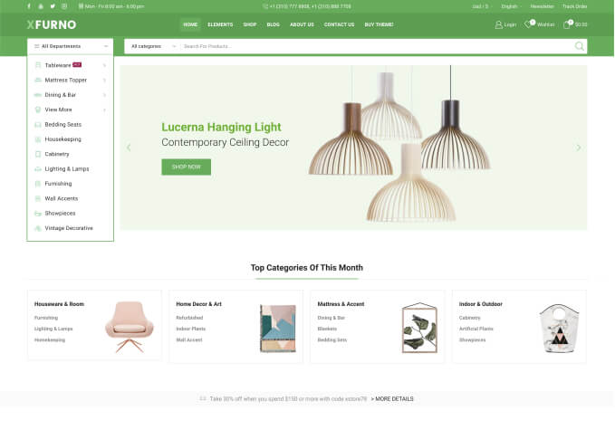
However, we would like to adjust it slightly to match the layout in the first sample image we provided: a vertical layout with two columns for the categories. Is there a way to achieve this structure?
We truly appreciate your continued support and the amazing customization options your theme offers. Looking forward to your guidance!
Warm regards,
Keesha
RegencyCigar.com
You must be logged in to reply to this topic.Log in/Sign up