This topic has 17 replies, 3 voices, and was last updated 10 years ago ago by widiantozhu
hi, can you please help me remove the extra bottom space as shown here? http://s1.postimg.org/5wphudhy7/remove_bottom_margin.jpg
it’s in this page: http://furnimaxx.com/
many thanks:)
hi, can you tell me how to decrease the gap/space between CTA box and jetpack subscribe widget as shown here? http://s9.postimg.org/ysubn3wzj/decrease_space.jpg
it’s in this page: http://furnimaxx.com/renovasi-kantor/
many thanks:)
Hello,
Please provide us with wp-admin panel credentials in Private Content.
Thank you.
Regards,
Eva Kemp.
hi eva, please see private content.
thank you:)
Hello,
I’ve added this code into custom.css file. Check it now, please.
.wpb_content_element{
margin:0 !important;
}
.content-page{
margin-bottom:0 !important;
}
Regards,
Robert Hall.
Hello,
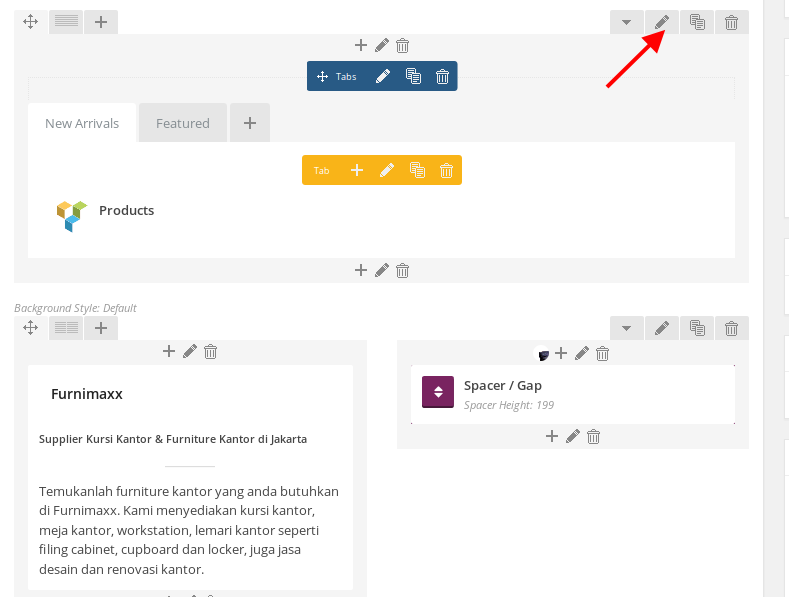
1. I’ve added margin-bottom value for the row of products via VC editor in Design Options tab:

2. I’ve added this code in custom.css file to decrease space on the page http://furnimaxx.com/renovasi-kantor/ :
.main-footer-1 {
    margin-top: -80px;
}
Please check the pages now.
Thank you.
Regards,
Eva Kemp.
hi eva, thanks for helping me solve the gap problem in http://furnimaxx.com/renovasi-kantor/, you rock!
hi robert, the codes that you added didn’t solve the problem, but it actually have made the slider with 3 boxes beneath it looks really good! thanks for that 😀
i actually needed a simple fix to the banner-background (sofa image in a container with Furnimaxx texts on the left), which is removing a small extra space underneath the sofa picture. so the sofa picture will be aligned-bottom to the container with no space at all in-between, and the new extra space on top of the furnimaxx text + sofa pic won’t be needed as well. you can see the reference here: http://s1.postimg.org/5wphudhy7/remove_bottom_margin.jpg
thanks a lot eva and robert. you guys go beyond the call of duty to help me fix it by yourselves. don’t you think you should start charging for customization?:)
Could you please show us link to this place http://s1.postimg.org/5wphudhy7/remove_bottom_margin.jpg ?
Regards,
Robert Hall.
hi robert, sorry for not being clear. it’s actually in the homepage: http://furnimaxx.com/
thanks for asking:)
Hello,
I’ve added the following code into custom.css file:
.vc_custom_1413455381954 {
   bottom: -10px !important;
}
Please check the page now.
Thank you.
Regards,
Eva Kemp.
hi eva, many thanks, it works! 🙂
Hello,
You’re welcome.
Regards,
Eva Kemp.
hi eva & robert,
i’ve tried to view furnimaxx.com on my nexus 4 smartphone, and apparently the homepage’s banners (3 banners under the slide) were broken and did not appear. i don’t know which code modification does it, and i also notice that the homepage loads considerably slow in my nexus 4 related to the broken banners issue.
can you please help? really sorry for the hassle. you can see what i mean here: http://s13.postimg.org/uppa8zxyf/brokenbanner_homepage.png
thanks again:)
Hello,
I’ve disabled the plugins and banners have appeared on a mobile device.
Please disable them one by one to find out which plugin is causing the issue.
Thank you.
Regards,
Eva Kemp.
hi eva,
i’ve just find out that the problem happens when i view the site in mobile site version in my nexus. while i switched view to desktop site, the banners were showing up again. so i kinda confuse: why a responsive theme have a mobile site version? it’s kind of counter-intuitive…
so the problem was not with plugins (i’ve deactivated them but the problem still persist) or with the codes (tried to remove all the above codes but nothing changes as well).
a couple questions:
1. why now there’s this mobile/desktop site link? i don’t remember seeing it before while browsing in my nexus.
2. https://www.dropbox.com/s/eiou2z90nnkm8a3/Screenshot_2014-10-18-23-59-04.png?dl=0. as you can see the related products widget and jetpack subscribe widget were missing from the footer area.
please help, thank you:)
sorry, jetpack subscribe widget is showing already, and somehow the desktop/mobile site link at the bottom of the footer were no longer appear.
hi eva/robert,
please see this picture about the smartphone/responsive issue that i mean: https://drive.google.com/file/d/0Bz_7YYBYxFwMbWJLbkt5S1FHMU1udGJ5UnpVOTIxaE44MGpz/view?usp=sharing
as you can see the ‘new arrivals/featured’ section has moved to the bottom-left part of the screen and shrunk. can you please help me fix it? really appreciate it. thanks:)
The issue related to '‘how i remove the extra space at the bottom of the banner background in homepage?’' has been successfully resolved, and the topic is now closed for further responses
