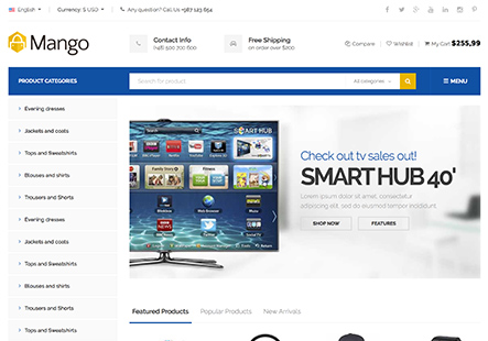
how to make full width dropdown seperate page on mobile menu, meaning that when its clicked, the dropdown menu shows in seperate popup. for better explaination, here is the video below of exactly what I want.
This topic has 8 replies, 3 voices, and was last updated 1 years, 11 months ago ago by Andrew Mitchell
how to make full width dropdown seperate page on mobile menu, meaning that when its clicked, the dropdown menu shows in seperate popup. for better explaination, here is the video below of exactly what I want.
Hello, Hanzla Nadeem,
Thank you for reaching out to us with your request. We appreciate you providing a video to clearly illustrate what you are looking to achieve with the mobile menu dropdown.
To create a full-width dropdown that appears as a separate popup on mobile devices, this typically involves customizing the mobile menu functionality.
Sorry, but additional customization is outside the scope of our basic support.
If you wish a developers team can personally assist you via customization service.
To get started, please follow this link to send your request with requirements – https://prnt.sc/PZkD4AEf27qO https://www.8theme.com/account/#etheme_customization_panel , and a detailed estimate for the customization work will be prepeared. Our goal is to create a design that aligns with your vision and enhances your website’s appearance and functionality.
Customize your website to suit your needs and make it stand out with expert dev team.
Thank you for your cooperation and understanding.
Best Regards,
8Theme’s Team
Actually I am student and doing it all my self without having knowledge of such thing and I cannot afford a website developer. just trial and testing the codes to get some better results. I would be glad if you can help me. thank you
Hello, Hanzla Nadeem,
Thank you for your swift reply.
We would like to inform you that the functionality you have inquired about is not present in our demonstrations, and we confirm that such an option is not available by default.
If you have any other questions or concerns, please do not hesitate to reach out to us.
Best Regards,
8Theme’s Team
Okay if its not possible, can you tell me how to fix the damaged result of dropdown images. the images and background color have some type of overlay or something changing the color of image and background color.
Hello, Hanzla Nadeem,
We would like to inform you that the default styles for the submenu can be modified using custom CSS. The following code snippet provides an example of how you can adjust the opacity:
div.mobile-menu-content .et_b_header-menu .menu li > .nav-sublist-dropdown:not(.nav-sublist) {
    opacity: 1;
}
Additionally, we advise against the use of static blocks within the mobile menu. For optimal navigation and user experience, we recommend creating separate menus for desktop and mobile versions.
Should you require any further assistance or have any questions regarding this matter, please do not hesitate to contact us.
Best Regards,
8Theme’s Team
Thanks. its fixed now
Dear Hanzla Nadeem,
Choosing our theme reflects your commitment to quality, and for that, we’re genuinely grateful. As we constantly strive to elevate your experience, your feedback is an invaluable gift. Could you kindly take a moment to rate our product with 5 stars on ThemeForest?
Click here to share your insights: https://themeforest.net/downloads
Your support fuels our journey, and we appreciate it more than words can express.
Best Regards,
The 8Theme Team
The issue related to '‘how to make full width dropdown seperate page on mobile menu’' has been successfully resolved, and the topic is now closed for further responses

