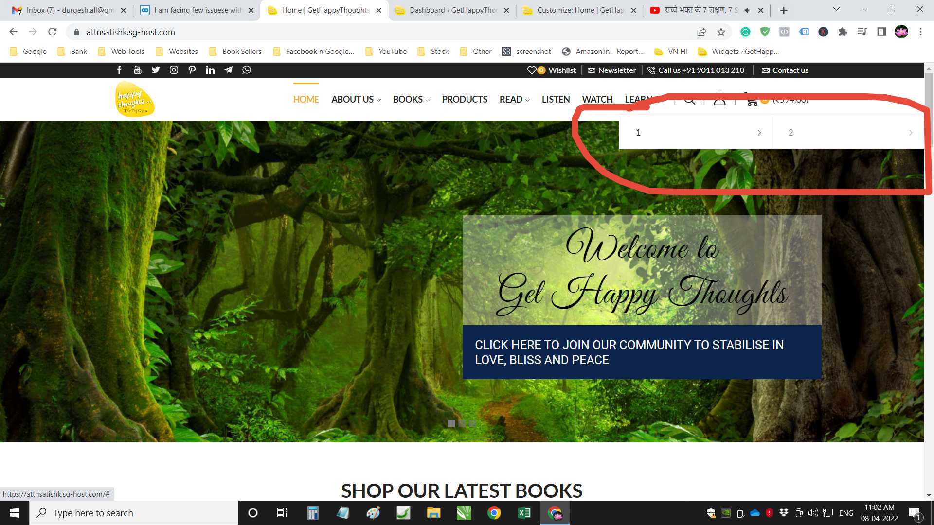
1 – How to align the product to the bottom everywhere (for all pages, shop, category, upsell, cross-sell)
https://snipboard.io/qVx52p.jpg
2 – How to align post to bottom everywhere (Home, related post and etc.)
https://snipboard.io/5cVY6n.jpg
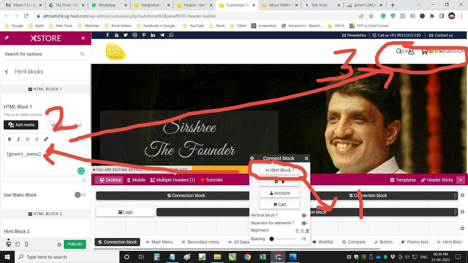
3 – My site main color set to #f1ac2b, why product active tab color is different, how to fix this
https://snipboard.io/uICysH.jpg
4 – Facing issue with Footer Fixed on mobile
Visit site On Mobile –> Croll to bottom –> expand any toggle –> you will see contents is getting hidden https://snipboard.io/nrbqgd.jpg
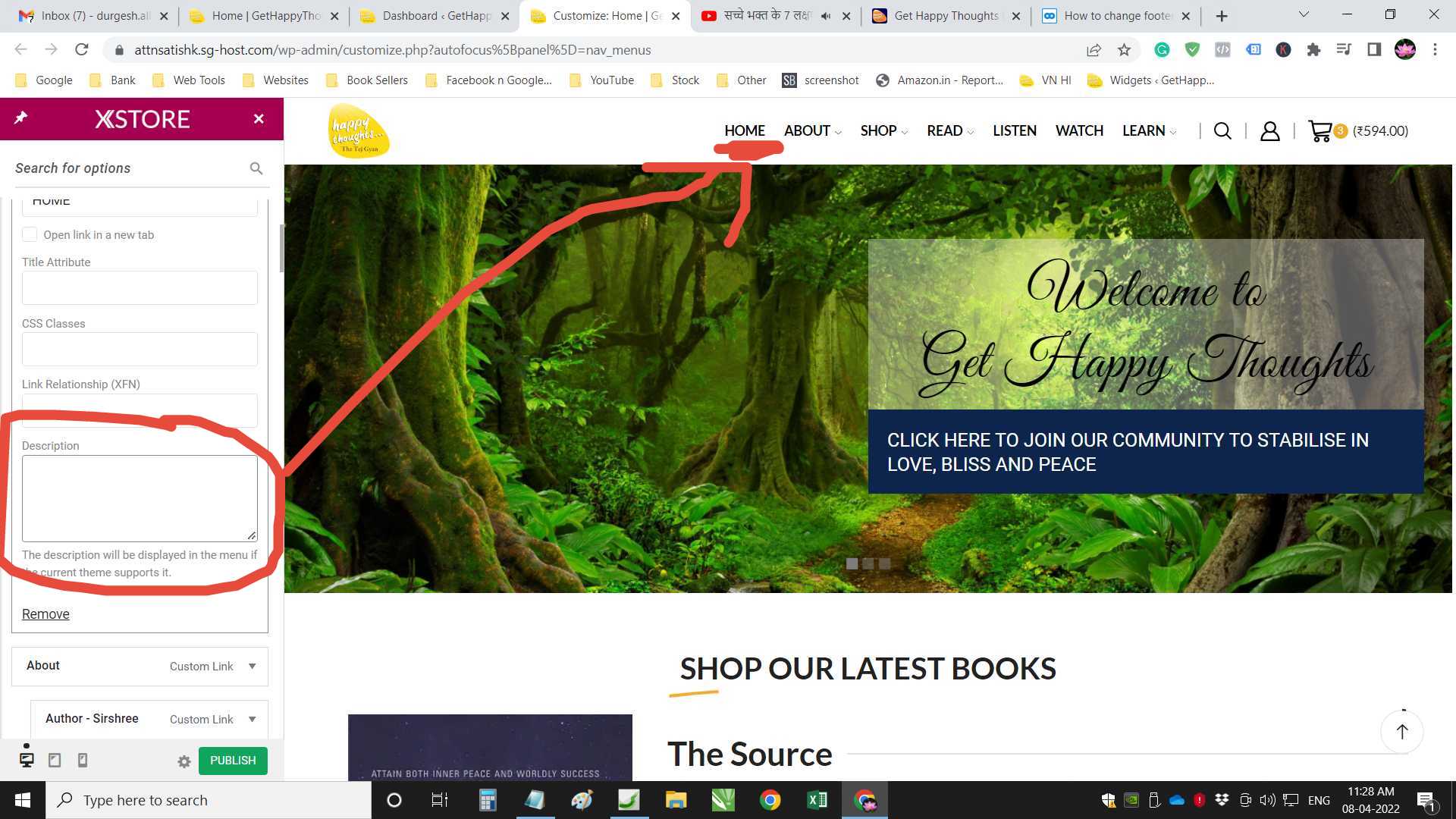
5 – How to set the color to #f1ac2b on mouse over
https://snipboard.io/eifdFc.jpg


