This topic has 8 replies, 3 voices, and was last updated 1 years, 5 months ago ago by Tony Rodriguez
Hi there at my website which is using 8themese theme, I am facing issue that when a home page is opened it is ok but when to click on the product in mobile view the product is not being displayed, please check at your end and let me know which is the proper solution for it, or what is the issue which is causing such problem thanks
Hello, M Arsal,
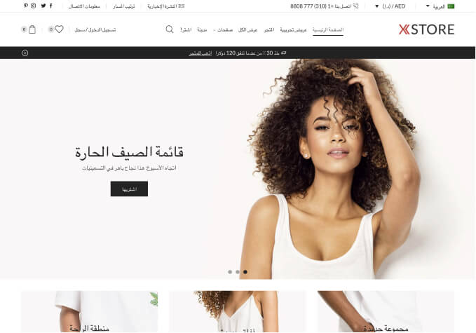
Thank you for contacting us and for using XStore.
Please make sure that the problem, on the single product page, is not caused by 3rd party plugin or your custom changes in theme files.
Provide us with temporary wp-admin access, so we can check your settings.
Thank you for your cooperation and we look forward to hearing from you soon.
Kind Regards,
8theme team
I have provided you with the required information
Hello,
Thank you for your response.
The problem is caused by the next custom styles – https://prnt.sc/-oLA7rcY6E3Z Please try to remember where in Elementor settings you added these styles for container.
Kind Regards,
8theme team
I can’t remember as I am not much expert in coding and that one you shared is regarding css which is styling terms, can’t you please over ride it to the default so the issue could resolve. Thanks
Hello, M Arsal,
Thank you for your response.
1/ Section with broken custom styles → https://prnt.sc/r2iCLaHWZ9fr
2/ Styles (+html) that we removed (and fixed your issues) are below;
3/ Please, check now !
<div class="container">
<div class="center">
<button class="btn">
<svg width="180px" height="60px" viewBox="0 0 180 60" class="border">
<polyline points="179,1 179,59 1,59 1,1 179,1" class="bg-line" />
<polyline points="179,1 179,59 1,59 1,1 179,1" class="hl-line" />
</svg>
<span>HOVER ME</span>
</button>
</div>
</div>
@import url('https://fonts.googleapis.com/css?family=Lato:100&display=swap');
body, html {
width: 100%;
height: 100%;
margin: 0;
padding: 0;
background: #5CA4EA;
overflow: hidden;
font-family: 'Lato', sans-serif;
}
.container {
width: 400px;
height: 400px;
position: absolute;
left: 50%;
top: 50%;
transform: translate(-50%, -50%);
display: flex;
justify-content: center;
align-items: center;
}
.center {
width: 180px;
height: 60px;
position: absolute;
}
.btn {
width: 180px;
height: 60px;
cursor: pointer;
background: transparent;
border: 1px solid #91C9FF;
outline: none;
transition: 1s ease-in-out;
}
svg {
position: absolute;
left: 0;
top: 0;
fill: none;
stroke: #fff;
stroke-dasharray: 150 480;
stroke-dashoffset: 150;
transition: 1s ease-in-out;
}
.btn:hover {
transition: 1s ease-in-out;
background: #4F95DA;
}
.btn:hover svg {
stroke-dashoffset: -480;
}
.btn span {
color: white;
font-size: 18px;
font-weight: 100;
}
Kind Regards,
8theme team
thank you for your kind support. issue is resolved.
Hello, @M Arsal,
We would be grateful if you could kindly leave a 5-star rating for our theme and customer and technical support on ThemeForest at http://themeforest.net/downloads. Doing so would help us to provide more updates and dedicated support in the future. Your support would be greatly appreciated.
Thank you for your time. We hope you have a wonderful day.
Please note that for any new issues, you should create a new ticket on the support forum.
This topic is now closed.
Warm regards,
8Theme’s Team.
Tagged: best selling, ecommerce, mobile view, product, showing, themes, woocommerce
The issue related to '‘In mobile view ecommerce product is not showing’' has been successfully resolved, and the topic is now closed for further responses