This topic has 8 replies, 2 voices, and was last updated 3 years, 3 months ago ago by queenb123
Hi,
For the love of God – i dont know why this theme keeps crashing on ipad chrome and safari – basically anything to do with the ipad it crashes – keeps reloading on its own and im just so fed up with it it – i have tested all the plusgins same results – i have looked at the coding – just seems that its the front page that keeps re-loading other parts of the site are ok but the front page either just crashes or keeps reloading!
This is EXTREMELY frustrating as the client is angry and i cant seem to sort this out – i bought this theme as it seemd like a stable theme – just keeps crashing on ipad!
So in a nutshell problems i am having:
1. (MOST CRITICAL) ALL ipad browsers – keeps crashing or reloading on its own (front page)
2. Rev slider wont show – just blank – i have checked and it is fine.
3. Site seems to have rendering issues – will render properly on chrome (desktop) – but wont on (safari or firefox destop).
4. Just slow in general – i have optimised all images
5. Some parts of the site such as product pages do not show the entire page of a product – sick of rebuildng pages and products – i have updated the theme and plugins- why all the errors!
Sick of all the errors – ive kept everything simple!
Please get back to me asap – or i will have to ask for a refund – just so frustrating!
ALSO:
Checkout page payment section messed up:
Hello,
1) I checked your site using iPad and did not face any problems
https://prnt.sc/1v5nmdg
https://prnt.sc/1v5npob
2) Slider works fine from our side if we check your site.
3) What render issues do you mean? I don’t see anything https://prnt.sc/1v5nxxz
4) Read this post about revolution slider optimization https://wpmudev.com/blog/optimize-slider-revolution-wordpress/
5) Could you, please, tell me what exactly is wrong here https://recordit.co/hpMEx1fGGh because shop page and single product page are ok for me.
6) It’s because plugin adds the position absolute for the images. Add the below code to Custom CSS to align them correctly
.woocommerce-checkout #payment ul.payment_methods li .card-brand-icons {
position: relative;
}
Regards
ok i will have a look at the rest later – BUT i have now discovered another issue, for some reason on the payment page the menu is messed up, please see:
Hi,
ok here are STILL some of the issues shown on video:
SLIDE:
1. On my wpbakery i have 3 types of slide – desktop, ipad and mobile, each should show in their respective screen.
2. When i look at the ipad version – it does not show all the slides (there are 10) and it crashes….view here:
BUT when i disable the destop slide in wpbakery – all the slides show???? The different slides should show at all time!
This is it crashing:
RENDERING:
As you cam see in this video, the page loads a little too slow and the rev slider is supposed to be in the middle:
I find that sometimes the page will load with the slide in the middle or it will not – it needs to ALWAYS load in the middle.
Here same issue with the slide NOT being in the middle.
In the video – half of this page is missing and everything loads up slowly – why is half the page missing and i have optimised the images to the max – still loads up slowly!
Really dont know why these issue are happning – i have filmed it so you see for yourself – please get back to me asap.
Thank you!
Hello,
To fix the issue with the mega menu go to Theme Options > Speed optimization > disable Ajax mega menu loading option. Clear cache and check the mega menu on the checkout page after that.
Revolution slider is heavy by itself and even 1 slider adds seconds to page loading. In your case, you added 3 sliders on the page. Why don’t you use responsive options of the revolution slider to show different layers suitable for every responsive breakpoint within the 1 slider https://youtu.be/inIULl3QolI ?
Regards
Hi thanks but there are so many issues to still deal with, but for now i will concetrate on the slide – each time i use the destop version slide for ipad it doesnt use the custom sizes i set – it just uses the desktop version hence why i had to create an ipad version – i can get the custom change to set for some reason, your video you sent is very outdated and i have googles about the slide and i just cant get it to work!
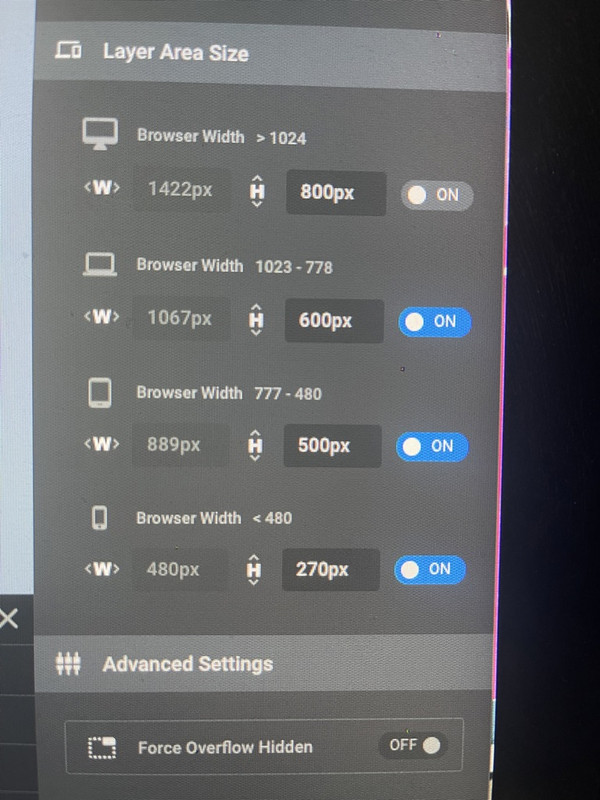
Here is my custom settings:
Im not sure ehy the slide is so heave as its mostly optmised images – i just cant get the ipad version to be set in the size i want!
Is there a way i can force the sizes i want for each devices – i find that either its greyed out or i cant choose a custom size for a carousel type slider!
I have played around with this so much it hurts!
I have set the slide like this:
DESKTOP: 1422px x 800px
MOBILE (Ipad) 889px x 500px
Phone (Iphone) 480px x 270px
The problem is, the MOBILE (Ipad) 889px x 500px is USING the DESKTOP: 1422px x 800px – in the Ipad is showing the DESKTOP size i have set – NOT the Ipad size i have set!
I cannot get this to be responsive to the exact measurements above – this is where the issue is!
This is why i have to have 3 slides in the home page – which are all respectively hidden from each devices – depending on what the viewer is using to view the site!
Really dont know how else to explain it!
The issue related to '‘IPAD CRASHES’' has been successfully resolved, and the topic is now closed for further responses