This topic has 6 replies, 2 voices, and was last updated 3 years, 10 months ago ago by Rose Tyler
hi,
The ipad menu look a little weird:
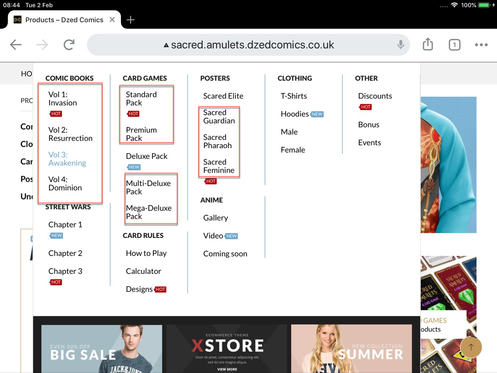
The longer words are collapsed – is there a way to stretch them out so they are just one word instead of two – just like the desktop version.
Ipad version:
desktop version:
Logins in private area – (please keep this secure as my site was hacked and it took me 2 days to rebuild everything.)
Many thanks!
Hello,
What screen size is it in px?
Try to set width here – https://prnt.sc/y1v9h0 , then clear cache and check.
Regards
Hi the screen size in pixels is:
1536 x 2048 Pixels
i have tried your suggestion above but then it affects the desktop version!
Hello,
Try to return your old version of settings back and then add custom css :
Theme Options -> Theme Custom CSS -> Global CSS
.et_b_header-menu .et-menu-list li a {
white-space: nowrap;
}
Regards
Hi,
When my site was hacked – the first thing i did was copy all old setting, the codes, everything etc!
I have pasted in your code and here is the results it got me:
i have removed it as this is not favourable
If it cant be fixed pls let me know.
Hello,
You can only set a few responsive css for best visual view
From our side we helped as we could.
Regards
You must be logged in to reply to this topic.Log in/Sign up