This topic has 4 replies, 2 voices, and was last updated 1 years, 8 months ago ago by Rose Tyler
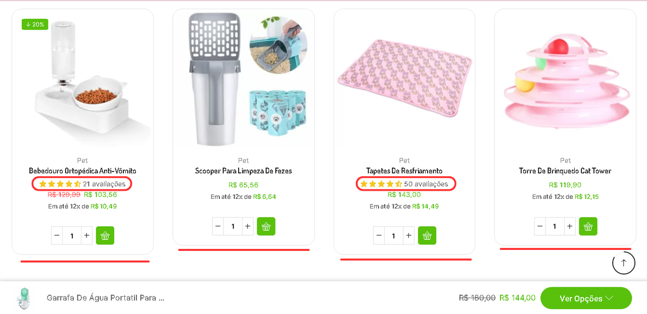
is there anything that can solve this carousel problem. just because the number of reviews appeared, the carousel was already all broken, one bigger than the other. in the mobile version it is even uglier.
and when fixed in the css, the carousel is very stretched. maybe there is a word limit that does that!. can you help me ? please
Hello, Dionizio Find,
We kindly suggest that you try using the following custom CSS code (Theme options > Theme custom CSS):
.main-products-loop .product, .products-loop .product, .carousel-area .product-slide .product {
display: flex;
justify-content: center;
}
.products-loop .ajax-content, .products-loop {
display: flex;
flex-wrap: wrap;
flex: 1;
}
.content-product {
flex-direction: column;
justify-content: space-between;
display: flex;
flex: 1;
}
.content-product .quantity-wrapper {
margin-right: auto;
margin-left: auto;
}
.swiper-container {
display: flex;
align-items: stretch;
}
.product-slide .product {
display: flex;
height: 100%;
}
.swiper-wrapper {
height: auto;
}
Kind Regards,
8theme team
thank you ver much 🙂
Hello, Dionizio Find,
You are always welcome!
To show appreciation to our development team, please consider rating our theme – https://themeforest.net/downloads . We value your feedback and it motivates us to continue creating high-quality products. Thank you for your support!
Kind Regards,
8theme team
You must be logged in to reply to this topic.Log in/Sign up