Dear Support Team,
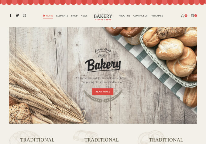
I’m encountering an issue with the alignment of the top bar content across different responsive views. The gaps between buttons and logos, as well as the top and bottom margins, appear inconsistent. The top bar was created using a static block.
Could you please assist me in resolving this? I’ve attached screenshots showing how the issue appears on various devices for reference.
HP 1080P : https://snipboard.io/2NyLm9.jpg
HP Display 768: https://snipboard.io/pQVgFo.jpg
Acer 23.8 inch Full HD Monitor: https://snipboard.io/FVs542.jpg
MAC BOOK AIR : https://snipboard.io/8dqBGF.jpg
Ipad PRO : https://snipboard.io/apdlhZ.jpg
Thank you for your support!
Best regards,
Merin


