To be clear, this does not constitute as paid for advice, as I am making use of native theme features which were promised to me, the buyer. Please advice me as best you can. I am past deadline. Should any additional information required, please do not hesitate to ask.
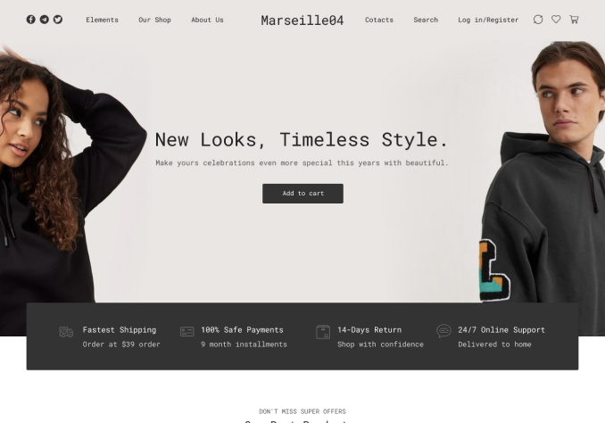
You have the underwear demo available to import. This is the demo which I attempted to import – it is worth noting I have done so multiple times, on clean installs, with latest updates across the board.
Refer to website link provided for better context.
—
I am having many issues. Let me first outline the aesthetic issues.
—
Header:
1.When the webpage is first loaded, the wishlist and shopping cart icons are wrong color/format. Therefore they are illegible. (http://charityeventuk.com/stagetwo/wp-content/uploads/2018/04/cart_wishlist__not_visible.png)
After a while, they either become visible, or the smart nav takes place of the original, where the format of the icons is correct. (http://charityeventuk.com/stagetwo/wp-content/uploads/2018/04/cart_wishlist__visible.png)
2. The number preview for both icons is different. On the wishlist it is on the corner, and on the cart it is inside the icon. (http://charityeventuk.com/stagetwo/wp-content/uploads/2018/04/cart_wishlist__visible.png)
3. The ‘view cart’ button within cart preview (on mouse hover) is not pink, but black, unlike the ‘checkout’ button above it. (http://charityeventuk.com/stagetwo/wp-content/uploads/2018/04/cartpreview__second_button__not__pink__unlike__first.png)
4. The ‘wiew wishlist’ button within wishlist preview (on mouse hover) is not pink, but black, unlike the ‘checkout button’ within cart preview. (http://charityeventuk.com/stagetwo/wp-content/uploads/2018/04/wishlistpreview__button__not__pink__unlike__first__button__in__cart.png)
5. The search box is the wrong color. It is also misaligned with respect to the lines above and below the menu. (http://charityeventuk.com/stagetwo/wp-content/uploads/2018/04/searchbar__misaligned.png)
—
Single Product Page:
6. The quantity button, add to cart button and other examples that may apply (such as attributes) are the wrong color/format. (http://charityeventuk.com/stagetwo/wp-content/uploads/2018/04/buttons__selectors__wrong__color.png)
This screenshot is taken from the demo (how they should look). (http://charityeventuk.com/stagetwo/wp-content/uploads/2018/04/buttons__selectors__correct__color__from__demo.png)
—
checkout:
7. Unable to read prompts, such as form requirements for example, because of wrong color. This is significantly worse on screens with higher brightness/saturation/contrast. (http://charityeventuk.com/stagetwo/wp-content/uploads/2018/04/checkout__cant__read__prompts.png)
8. The actual checkout forms are the wrong color (black).
9. The dropdown for region selection is the wrong color, in contrast with the rest of the checkout form(s).
9. The dropdown for region selection is temperamental. Furthermore, the region selected is not visible within the dropdown on desktop, rather below it. (http://charityeventuk.com/stagetwo/wp-content/uploads/2018/04/checkout__region__not__in__dropdown-.png)
10. The region selected is not visible on tablet/mobile at all. Makes checkout impossible. (http://charityeventuk.com/stagetwo/wp-content/uploads/2018/04/checkout__region__not__at__all__visible__on__mobile-.png)
11. The ‘your order’ summary section is the wrong color/format. It is a black box inside a purple container with the same background color as the site. This makes for a poor aesthetic. (http://charityeventuk.com/stagetwo/wp-content/uploads/2018/04/checkout__your__order__wrong__color.png)
—
Even if you do not think the above is part of the demo content, please do your best and provide the instructions (such as CSS code – not how to do CSS myself), if it is possible.
—
I require assistance on the following. Please assist. Not to presume. However, I doubt it’ll be much of a nuisance to you, as the code already seems to exist. it would be much appreciated.
Filters:
12. I have many filters on the shop sidebar. This drastically increases the length of the webpage, making the website unpleasant to use. (http://charityeventuk.com/stagetwo/wp-content/uploads/2018/04/filter__longpage__view.png) (http://charityeventuk.com/stagetwo/wp-content/uploads/2018/04/filter__upclose.png)
I have found somewhat of a solution. If I place filters within the ‘filter’ widget area, the list becomes scroll able. This fixes my problem. Unscrolled:(http://charityeventuk.com/stagetwo/wp-content/uploads/2018/04/filter__scrollable1.png) Scrolled:(http://charityeventuk.com/stagetwo/wp-content/uploads/2018/04/filter__scrollable2.png)
How would I instruct this same format on the shop sidebar, as opposed to the ‘fitler’ widget area. Also if possible, how would I make these say “only show three options and then require scrolling” than say the default five.
—
Thank you for taking the time to read the above.
Should any hyperlinks fail, the links to images have also been provided in text. Any errors would be due to the forum UI. I’d recommend an upgrade in the form of a visual editor instead of just text editor, with reference to the WordPress classic editor options. Great forum, just a thought.
Images have also been named appropriately, should you need to download them, or want to easier browse through.
Please do your best to assist. Below is the default CSS code which was automatically imported and is applied to the site.


