This topic has 12 replies, 3 voices, and was last updated 4 years, 7 months ago ago by Rose Tyler
Having some issues with formatting on mobile devices. There are sections that have a colored background and the font doesn’t fit in the section. Please respond via email and I can show you a screenshot.
Hello,
Lightshot Screenshot tool https://app.prntscr.com/en/index.html makes screenshots and generates links then you can provide links of screenshots here.
Also, provide temporary wp-admin access.
Regards
Sorry I didn’t want to download the program, I will explain in private content area
Hello,
1) Add this code in Theme Options > Theme custom CSS > Custom CSS for mobile:
.autoscrolling-item {
    font-size: 12px;
}
2) Set “Default” color scheme for the Cart – http://prntscr.com/s3rt79 (same as it is for Wishlist icon right now).
Regards
This worked great, thanks!
The other areas I’m having trouble with on mobile are:
1) the very top header bar that has a carousel text area, but the text doesn’t fit on mobile
2) there is a “banner with mask” element near the bottom of the page that says “Pamco Introduces The FC2″… but the image is now behind the text, making it hard to read, and the “VIEW PRODUCT” button’s margins are different and the text isn’t centered within the button.
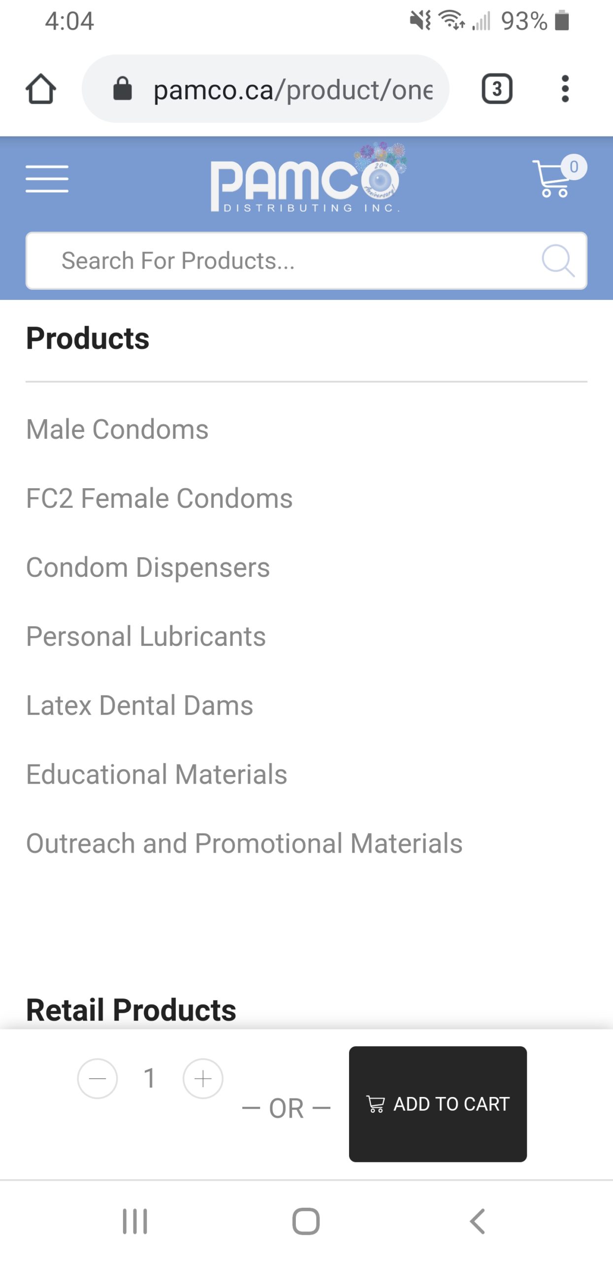
3) the add to cart button on the product pages when you scroll below the product has some of it’s elements not centered properly. The part that says – 1 + – is not centered with the – OR – Add to Cart.

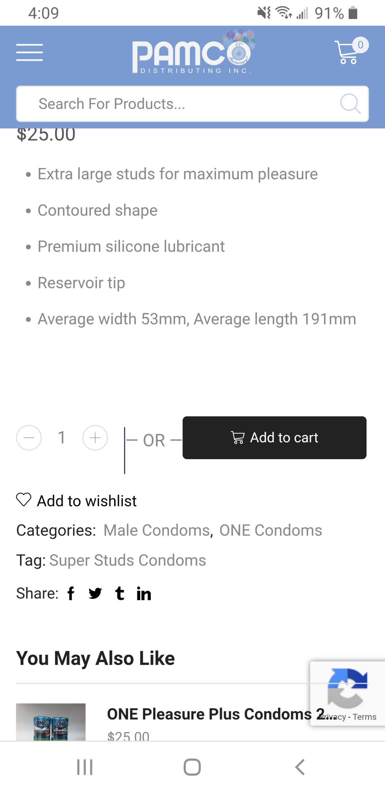
This add to cart section also doesn’t look good at the top of the product page either. There is a strange black line in there.

Hello,
1) You can change content zoom – http://prntscr.com/s7t3og
2) Try to add the next code –
@media only screen and (max-width: 480px) {
    .banner-type-2:hover .banner-content a.btn {
        padding-top: 13px;
    }
    .banner .banner-content .content-inner p:first-child {
        text-shadow: #fff 3px 0px 2px;
    }
}
in Custom CSS for page.
3) At your screenshot, I see the “OR”, but there is no this when I’m checking a product – http://prntscr.com/s7tid1 What is that? And how can I get it?
Regards
Hello,
Thanks for the help! the first 2 worked, as for the 3rd one, I get that on mobile on every product page. The first screenshot is when you scroll down on the product page and the add to cart section has a sticky scroll effect and appears at the bottom. In the second screenshot, this is just how all product pages look on my phone. The add to cart section always has that strange black line in it.
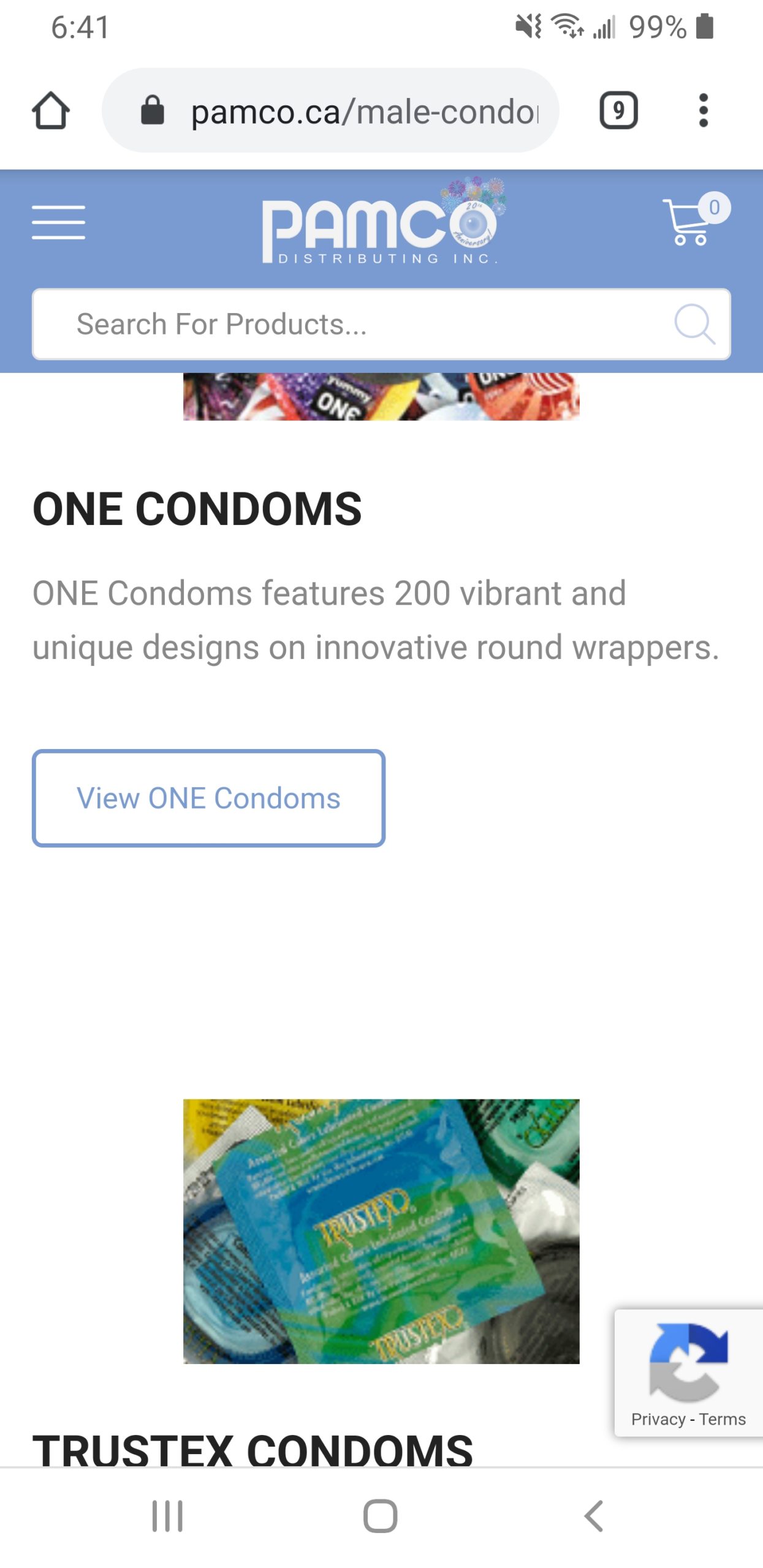
I also found another formatting issue on mobile, on this page https://pamco.ca/male-condoms/ some of the elements have different alignments that look good on desktop but not on mobile. Is it possible to have everything center aligned on mobile? Please see the screenshot attached

Hello,
Add this custom CSS code:
.single-product-builder form.cart p#wc-stripe-payment-request-button-separator,
.etheme-sticky-cart #wc-stripe-payment-request-button-separator{
    display: none !important;
}
You can use mob-center custom class, for example – http://prntscr.com/sqkn4m
Regards
Hello!
Thanks for the help with that!
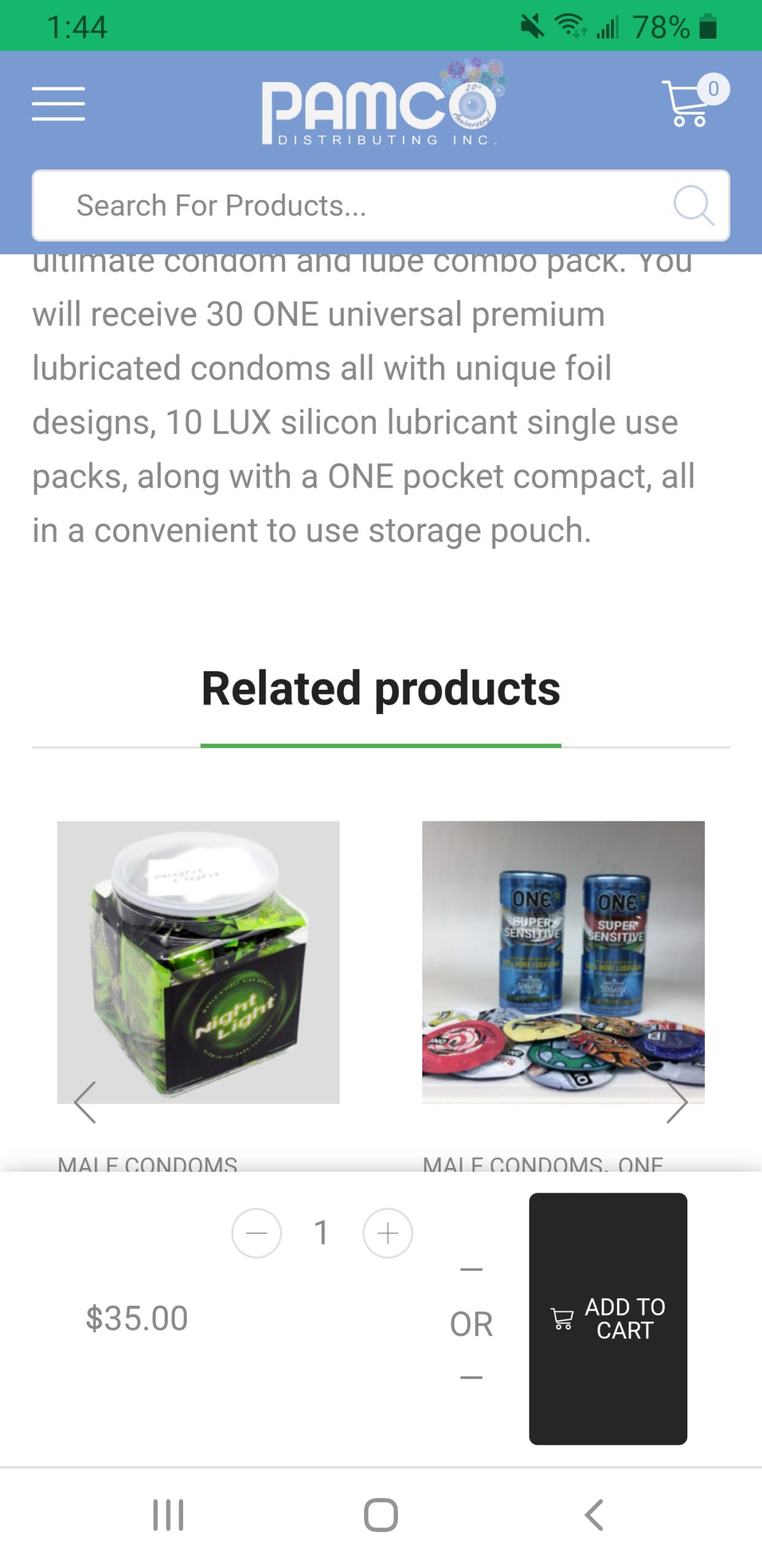
Still need help fixing the products pages. Do you see what I mean by the sticky Add To Cart section that comes up when you scroll down any product page on mobile? Here is another screenshot 
Hello,
I don’t see the mentioned issue http://prntscr.com/ss7lb6
Please, provide us with a link to product where problem still persists.
Regards
Seems to be working fine today… maybe the last update fixed it
Let us know if you need any other assistance.
Regards
You must be logged in to reply to this topic.Log in/Sign up
