This topic has 6 replies, 2 voices, and was last updated 10 years, 9 months ago ago by Eva Kemp
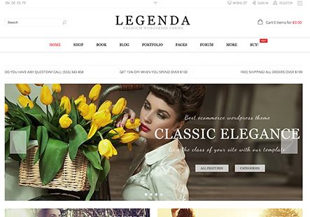
I want to center the logo on a mobile device when it is in portrait mode. The logo currently goes to the left and is touching the navigation menu. I want it to be centered just like the vertical screen mode is. Also I want to change the color of the double-border that the nav-menu sits in.
Hello,
Please read the Legenda documentaion https://www.8theme.com/demo/docs/legenda/index.html#!/legenda_theme_options > Legenda Theme Options > Responsive
Regards
I am sorry but your answer does not address my question at all. I am aware of how to turn on responsiveness. What I am unaware of is how to accomplish what I asked. I also see that another user chouston92, asked the same question. Please answer my question regarding centering the logo when the theme is viewed in on a mobile device. Thank you.
Thank you for your reply.
Unfortunately we can’t reproduce the issue with logo on our side. Could you please provide us with the site and admin panel credentials?
You can change border color in custom.css, just add the following code and write the color you need:
.main-nav .double-border, .main-nav {
border-top: red;
border-bottom: red;
}
How to create custom.css file you can watch here
Regards
Hello Eva. Thank you for help regarding the border. You can reproduce the issue with the logo on a mobile device or on the desktop when you resize your screen. one you go below 980 px in the width the screen shifts to mobile view. In that view the default logo shifts to the left of the screen. As you continue to resize the screen the logo goes further left and starts to touch the navigation (three bar) link. I would like the logo to stay centered and not shift to the left.
You may log in to the at http://www.thedivineexpression.com/
the first page you can enter the access key as kappatest1
then resize the screen to reproduce the issue.
I believe that you guys use a media query to have the logo shift based on the size of the screen. I am not knowledgeable enough in using media queries to understand how to make my request happen.
It also moves over to the left on the demo that your have on your site. Just resize the screen to the size of a phone and the theme will go into mobile mode.
https://www.8theme.com/demo/legenda/
Thank you,
Hello,
We advise you to update the theme to the latest version and move all the changes you’ve made into custom.css or child theme.
Also you need to add the following code to the custom.css file to center the logo:
@media (max-width: 480px)
.header .logo {text-align: center;}
Or if you want to hide the logo on desktop:
@media (min-width: 1200px)
.header .logo {display:none;}
Regards,
Eva Kemp.
The issue related to '‘Logo mobile device’' has been successfully resolved, and the topic is now closed for further responses