This topic has 6 replies, 3 voices, and was last updated 3 years, 1 months ago ago by Olga Barlow
Hi,
Q1. I want to use mega menus for desktop, and regular menus for mobile; how can I implement this dual system?
Q2. How can I set a fixed width for the sidebar in product category pages (desktop)?
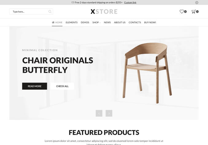
Q3. How do I set the position of mega menus’ starting horizontal coordinates? As shown in the attached screenshot, each of the menus start at different positions.
Q4. Also, I have been trying to add padding to the menu item (the ‘X’ area), but it seems the menu’s width is fixed; how can I set the width to be responsive rather than setting a fixed width?
Q5. How can I add new filtering criteria to sidebar in product category pages?
Thank you,
Amir
Hello,
1/ Create menus via Dashboard > Appearance > Menus, then go to Theme Options > Header builder > select menus for Main menu and Mobile menu elements.
2/ Provide URL of the category page and describe the desired result in more detail. Maybe it can be achieved using custom CSS code.
3/ It is aligned center according to the parent Main menu item.
Try to activate Mega Menu Dropdown Full-Width in Theme Options > Header builder > Main menu.
4/ Could you provide URL and temporary wp-admin access?
5/ Theme options > General > Enable Old Widgets Panel > On, then go to Dashboard > Appearance > Widgets > add widgets into Shop sidebar area
Regards
Thanks very much for thorough response.
Re. item 2, the URL in private content. As shown in the attached screenshot, I want to fix the width of the sidebar so it is not unnecessarily too wide.
Re. item 4, pls. see private section
Hello,
By default, sidebar takes 1/4 of the page width. If you want to reduce the size of the sidebar you can edit the shop page and change the width to 1/6 https://prnt.sc/1wy5f8k if it suits your needs.
Regards
Pls. also reply to issue 4, pasted below and the admin access info. in the private content of previous message.
Q4. Also, I have been trying to add padding to the menu item (the ‘X’ area), but it seems the menu’s width is fixed; how can I set the width to be responsive rather than setting a fixed width?
Hello,
Oh, take my apologies, missed that.
1) Don’t use left-right margins for the elements of the Static block (neither rows nor columns or images).
2) Use padding for the row with the content https://prnt.sc/1x3l2yp
3) Use columns gap if you need to add space between columns https://prnt.sc/1x3lvgo or use columns padding if you need.
4) you can change the width of the mega menu by changing the number of columns here https://prnt.sc/1x3m617 because it works like width limit for cases when you use Static block for the mega menu than default mega menu way.
5) You can also use custom width for the mega menu https://prnt.sc/1x3mb94
Check your menu now.
Regards
You must be logged in to reply to this topic.Log in/Sign up