This topic has 4 replies, 3 voices, and was last updated 7 months, 1 weeks ago ago by Andrew Mitchell
Hello,
When “display as on computer” is selected on the phone, is it possible to somehow unlock the user’s choice of grid columns? So that he can display 1-6 and so that the container size expands?
(Or if 4/5/6 looks weird then at least can 1/3?)
/And if there is no option, is it possible to hide the selection of options 1/3/4/5/6 in this view mode?
Thank you in advance
Hello @Kombajn88
Achieving this goal involves migrating your product archive template to the XStore Product Archive, which is based on the Elementor builder. For a detailed guide on this process, you can refer to our documentation here: https://www.8theme.com/documentation/xstore/xstore-builders/xstore-products-archive-builder-with-elementor/.
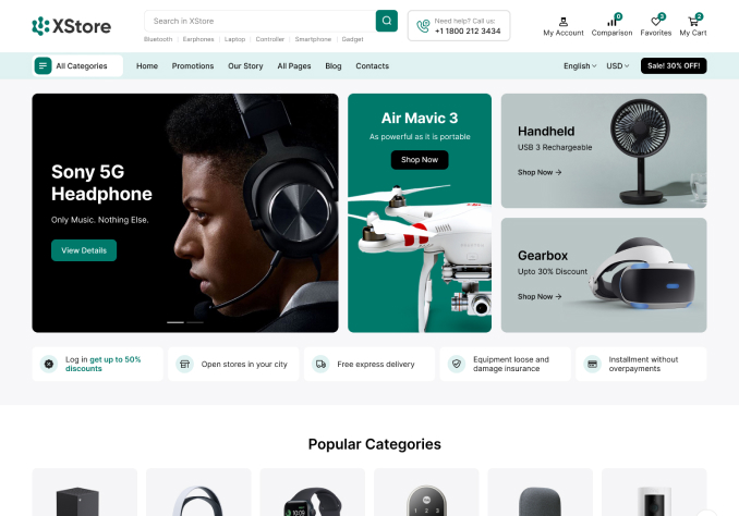
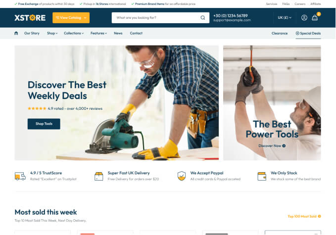
Furthermore, to explore the latest demos rebuilt with the new Products Archive builder, you can visit the following links:
– https://xstore.8theme.com/elementor3/electronic-mega-market/shop/
– https://xstore.8theme.com/elementor3/grocery-mega-market/shop/
These demos showcase the enhanced capabilities and design options available with the new builder, empowering you to create stunning product archive layouts efficiently. Take a look and get inspired to elevate your online store experience!
Kind regards, Jack Richardson
Thank you very much for your help, you are super support!
Dear Kombajn88,
We hope you’re reveling in the experience our theme brings! Your enthusiasm is what fuels our passion. Would you be so kind as to channel that energy into a 5-star rating on ThemeForest? Your feedback is the spark that lights our way!
Click here to spread the love: https://themeforest.net/downloads
Thank you for being an integral part of our journey!
Best Regards,
The 8Theme Team
The issue related to '‘mobile display as on computer, is it possible to somehow unlock the user’s choice of grid columns’' has been successfully resolved, and the topic is now closed for further responses