This topic has 4 replies, 2 voices, and was last updated 3 months, 2 weeks ago ago by Tony Rodriguez
Hi,
Our mobile header is not formatting correctly around 75% of the time on the homepage. This is extremely worrying as 95% of our traffic is on mobile devices.
Are there any reasons this could be caused? It’s as if it is taking the desktop formatting instead?
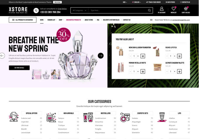
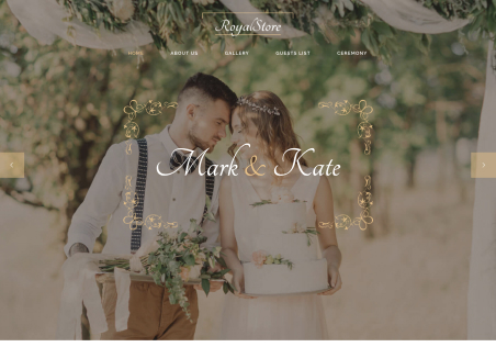
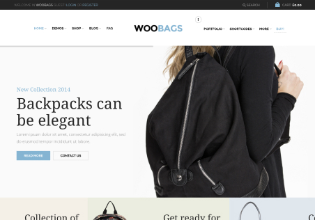
I’ve attached screenshots of how it is formatting compared to how it should be (shown on another page).
I have seen a formatting warning above the page in one instance, please see on one of the attached images
Hello, @Dylan,
Thank you for choosing XStore as your WooCommerce WordPress theme.
We suggest that you turn off the “Mobile User-scalable” and Mobile Optimization option in (XStore > Theme Options > General) if you are using a cache plugin for mobile devices, as both optimization options can conflict with each other and will not improve the speed together.
We trust this will resolve your issue. Should you require further assistance, please do not hesitate to contact us.
Best Regards,
The 8Theme Team
Brilliant thanks for your help!
Hello, @Dylan,
You are welcome!
As we continue our mission to exceed expectations, your insights become increasingly valuable. Could we, with all due respect, request your thoughtful feedback by giving our theme a deserved 5-star rating on ThemeForest?
Click here to share your valuable perspective: https://themeforest.net/downloads
Your time and trust are highly appreciated!
Best Regards,
The 8Theme Team
The issue related to '‘Mobile Header Not Formatting Correctly On Homepage’' has been successfully resolved, and the topic is now closed for further responses