We are designers, website developers, coders, and experts all rolled up into one. We’re here for the long run and we want you to be happy with our best eCommerce WordPress Themes and come back for more. From a simple brochure website to an advanced eCommerce solution with an integrated forum or membership website. We guarantee that the original and fashion website WordPress template will increase the number of customers on your site and make it more satisfied. The image of your company depends on the functionality and design of your site. Therefore a responsible approach to the design is essential. We will make your site unique and different from others and even more attractive to its visitors – order our best eCommerce Themes!
The 8theme studio’s develops new WordPress template for a website for online stores of any complexity. Our team consists of highly skilled developers and designers. Everyone knows how complicated site development is. To prevent misunderstanding among the performers and to avoid poorly organized workflow, we suggest operation in a small crew . No matter whether you have a single developer or a few of them, we are ready to offer the best solution in your situation. It is our Premium WordPress Themes! You can create a site, which reflects your business goals and makes clients happy, on the basis of our beautiful website WordPress template. And yes, we claim to have the best support along with the very best eCommerce themes.
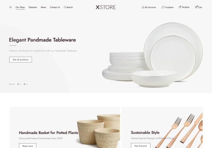
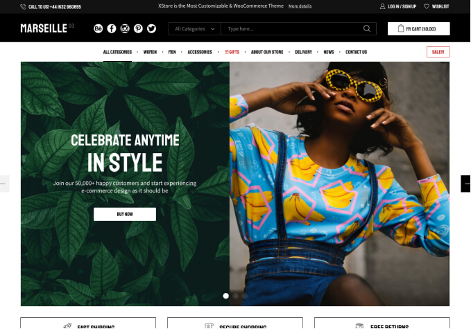
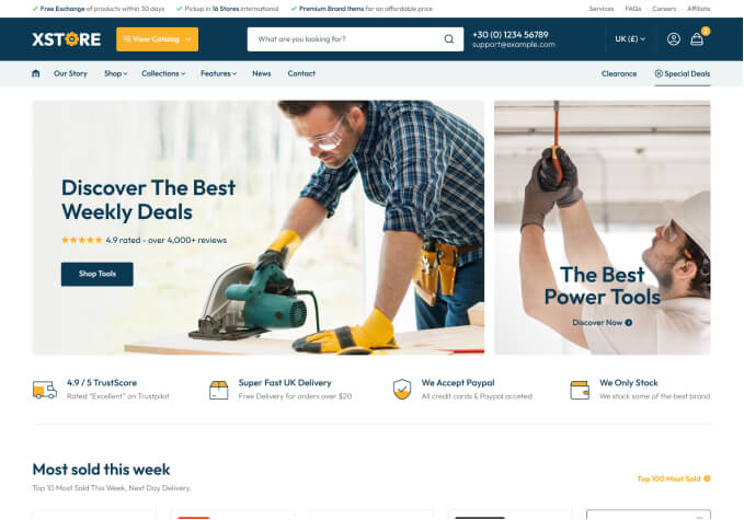
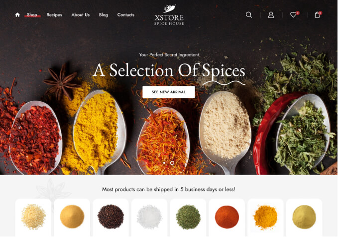
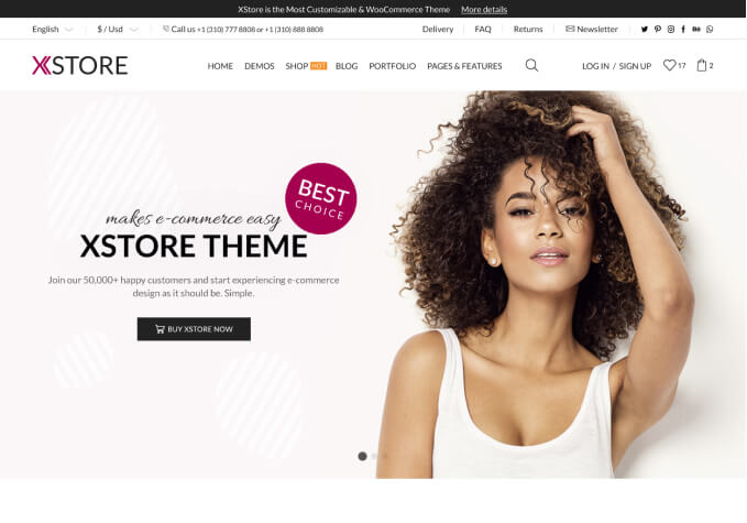
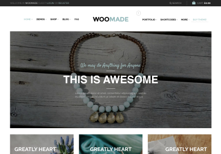
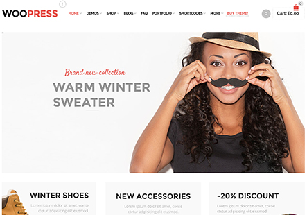
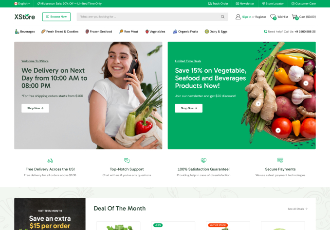
Pre-designed WordPress themes by 8Theme, crafted with top e-commerce best practices, are the most cost-effective way to take your business online. Use the Live Preview feature to find your perfect match!
More Information