Permanent visible top menu - by mt82 - on WordPress WooCommerce support

This topic has 10 replies, 2 voices, and was last updated 10 years ago ago by Eva Kemp

  • Avatar: mt82
    mt82
    Participant
    January 3, 2015 at 00:04

    Hello, is it possible to set top menu permanent visible? Now it’s set that with resolutions smaller than about 1230 px is top menu “hidden” and you have to click on 4 dashes on the left from logo which a lot of customers may not notice.

    Thank you.

    Michal

    9 Answers
    Avatar: Eva
    Eva Kemp
    Support staff
    January 3, 2015 at 14:58

    Hello,

    Please provide us with a link to your site.
    As I understood you want to display top bar on all mobile devices, don’t you?

    Regards,
    Eva Kemp.

    Avatar: mt82
    mt82
    Participant
    January 3, 2015 at 18:32

    Hi there, I meant top bar on monitors with smaller horizontal resolutions like 1200 or 1024 or when you manually resize browser window.

    On mobile devices it’s ok, but on monitor it’s strange, when there is no menu and only those 4 dashes.

    Link is below.

    Thank you, Michal.

    Please, contact administrator
    for this information.
    Avatar: Eva
    Eva Kemp
    Support staff
    January 5, 2015 at 09:04

    Hello,

    You can try to edit the media query located in the responsive style sheet file wp-content/themes/royal/css/responsive.css (line 1005).
    Changed it from
    @media only screen and (max-width: 1200px)
    to
    @media only screen and (max-width: 992px)

    Thank you.
    Regards,
    Eva Kemp.

    Avatar: mt82
    mt82
    Participant
    January 5, 2015 at 23:23

    Thank you, it works good! 🙂

    But with this thing (when you resize the window to smaller horizontal size), I don’t like, when I make window smaller than about 1230 px, and there are 2 big product photos (on homepage in NEW ARRIVALS). Is it possible to have there 3 smaller products (and their photos) or 4 even smaller instead of 2 big? On your Royal Minimalist demo store it works good, but I don’t know how to set it on my website.

    Thank you and have a nice day.

    Michal

    Avatar: Eva
    Eva Kemp
    Support staff
    January 6, 2015 at 09:22

    Hello,

    Sorry, but there is no feature to change it.

    Please take our apologies.

    Regards,
    Eva Kemp.

    Avatar: mt82
    mt82
    Participant
    January 6, 2015 at 11:56

    Hello Eva, I don’t think we need to directly change it, but maybe only set it the same way, like it’s set on your demo site, where this already works fine. Would it be better if we make our product images smaller or something like this?

    Thank you and have a nice day.

    Avatar: Eva
    Eva Kemp
    Support staff
    January 6, 2015 at 15:05

    Hello,

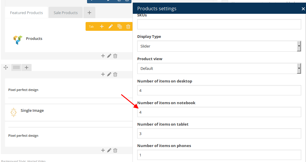
    In this case you need select Number of items on tablet in Products element settings in Visual Composer editor:

    Thank you.
    Regards,
    Eva Kemp.

    Avatar: mt82
    mt82
    Participant
    January 6, 2015 at 16:04

    Perfect, thank you very much!! 🙂

    Michal

    Avatar: Eva
    Eva Kemp
    Support staff
    January 6, 2015 at 16:15

    Hello,

    You’re welcome.

    Regards,
    Eva Kemp.

  • Viewing 10 results - 1 through 10 (of 10 total)

The issue related to '‘Permanent visible top menu’' has been successfully resolved, and the topic is now closed for further responses

We're using our own and third-party cookies to improve your experience and our website. Keep on browsing to accept our cookie policy.