This topic has 6 replies, 3 voices, and was last updated 3 years, 4 months ago ago by Rose Tyler
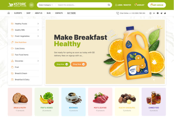
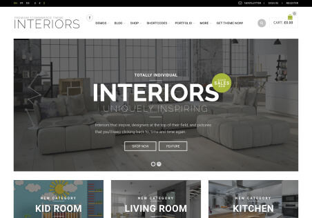
I have some problems with the tablet and mobile phone landscape display. If you check my homepage in landscape mode you will see that the site looks broken.
But only this section attachment1
Could you help me fix this?
I also can’t remove this mini cart and search icons in top header attachment2
The remove button doesn’t work at all.
Hello,
1) I don’t see the critical issue on the tablet or mobile https://prnt.sc/1sanotw
Do you mean the columns look too slim? You can show 1 column per row for the table and mobile using column responsive settings https://prnt.sc/1sao5nd
2) Fixed. Check now.
Regards
Please check my screenshot.
The issue on some phones is that the middle column is displayed over the first one. And after that, there is huge white space.
Hello,
Issue caused by your margins for the row https://prnt.sc/1saq9mn and columns https://prnt.sc/1saq4gk
I removed the mentioned margins and columns look ok for the mobile https://prnt.sc/1saqvv0
Regards
Thank you. It works.
Hello,
You’re welcome!
Regards
You must be logged in to reply to this topic.Log in/Sign up