This topic has 3 replies, 2 voices, and was last updated 1 years, 10 months ago ago by LucyLu
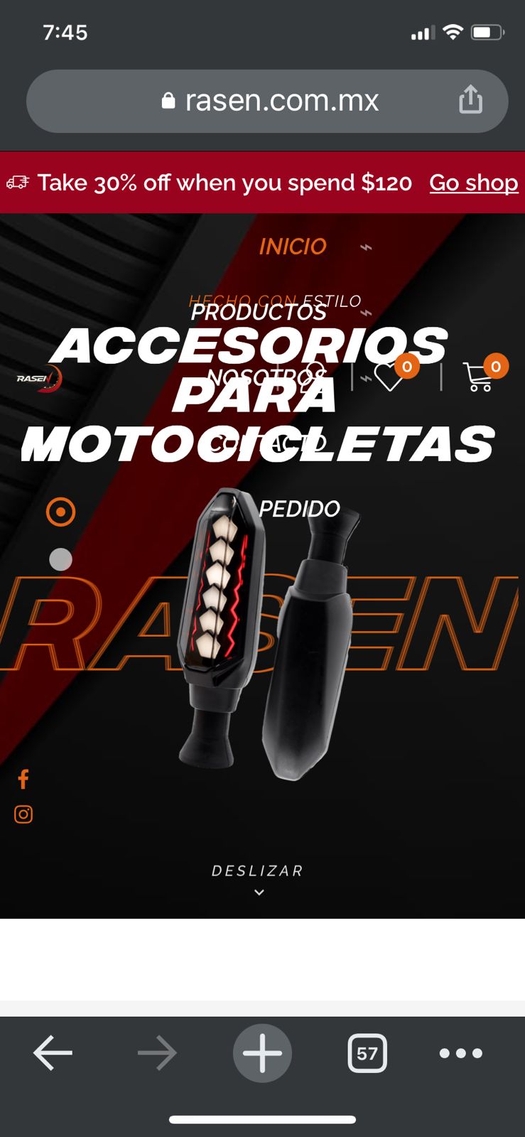
Hello, when I make a change in the header of my web page it changes to desktop mode or mobile mode depending on the setting. The problem is: the header changes to the same mode on all devices, not responsive. For examplee, if I make a change in desktop mode, in mobile version it looks like desktop, I’ll send you ss to explain myself better. Would you help me?
Hello @LucyLu,
We suggest that you try disabling Mobile Content Optimization through Theme Options >> General/Layout, clear the cache, and then check the results.
If this does not resolve the issue, please provide us with your WordPress Admin URL, Username, and Password in the private content area of this topic so that we will further investigate it for you on your site and help you out.
Please note that it is important to take a complete backup of your site before doing so.
Thank you for your cooperation.
Best Regards,
8Theme’s Team
Do you mean “Mobile Content Optimization”? I don’t see the Mobile Header Optimization option
The issue related to '‘Problems with the header and main menu of my website.’' has been successfully resolved, and the topic is now closed for further responses