Product Arrangement not even - by jrejon

This topic has 12 replies, 2 voices, and was last updated 10 years, 6 months ago ago by Eva Kemp

  • Avatar: jrejon
    jrejon
    Participant
    April 28, 2014 at 14:01

    Hello, I’ve setup the site successfully but for some reason I always have two empty product slots at the end of page #1. In other words, I have this page setup to showcase 3 rows and 4 columns which would be a total of 12 products, well it only shows 10, the two last spots are empty and I have to go to page #2 to see the rest of the products. Here is the page so you can take a look, thanks!

    http://jdcloset.com/?post_type=product&paged=1

    11 Answers
    Avatar: Eva
    Eva Kemp
    Support staff
    April 28, 2014 at 17:23

    Hello,

    Please provide us with FTP and admin panel credentials.
    Also please create custom.css file in the theme directory and enable it in Theme Options > Custom CSS > On.

    Regards,
    Eva Kemp.

    Avatar: jrejon
    jrejon
    Participant
    April 28, 2014 at 20:01

    Dear Eva, to login please use the info in the private section of this message.

    I enabled the use of custom css but not sure how to create the custom.css file you requested. If you explain I’ll do this immediately. Thanks!

    Please, contact administrator
    for this information.
    Avatar: Eva
    Eva Kemp
    Support staff
    April 28, 2014 at 20:23

    Thank you for the login details.
    But we also need FTP credentials.
    You can watch this video tutorial how to create custom.css. This video is for Legenda theme but the process is the same.

    Regards,
    Eva Kemp.

    Avatar: jrejon
    jrejon
    Participant
    April 29, 2014 at 13:16

    Please explain how do I give you FTP credentials. I thought you only needed access to the wordpress install.

    Avatar: jrejon
    jrejon
    Participant
    April 29, 2014 at 13:21

    Ok, I followed the video and created the custom.css. That part is ready.

    Avatar: jrejon
    jrejon
    Participant
    April 29, 2014 at 20:47

    Eva, the issue might have to do with screen resolutions. I’ve checked the site on a few computers and get different issues.
    – On some computers the logo gets moved to the right side (instead of being on the left where it belongs)
    – On some computers the left side of the rotating banner gets cut off. So much that the text in one of the slides can’t be read.
    – On some computers I get the same issue I described above where the two last spots in the products page are missing and the products continue on the second page.

    I thought this info would help.

    Best,

    Avatar: Eva
    Eva Kemp
    Support staff
    April 30, 2014 at 08:53

    Hello,

    Sorry for a delay.
    You can check your site now.
    Also you should change the amount of products on the page to 3. It can be done in Settings > Reading > Blog pages show at most.

    Regards,
    Eva Kemp.

    Avatar: jrejon
    jrejon
    Participant
    May 1, 2014 at 15:23

    Eva, I was able to fix the empty product areas issue. By going to Settings > Reading > Blog and selecting 12 posts. Then going into theme options > Product Page Layout and selecting 4 products per row. So that issue is resolved. However, there are some other issues like the banner getting cut off and the logo moving to the right of the page. Anything we can do there? Thanks!

    Avatar: Eva
    Eva Kemp
    Support staff
    May 2, 2014 at 20:48

    Hello,

    As I see you’ve selected the type of header where logo is situated on the right side. Could you please provide us with the link to check the banner issue?

    Regards,
    Eva Kemp.

    Avatar: jrejon
    jrejon
    Participant
    May 5, 2014 at 15:52

    Hi Eva, thanks for your reply, I am not sure that I selected the type of header where the logo is situated on the right side. I don’t even see that option in theme options > header – There are 6 options there and unless my eyes are playing tricks on me, none of them are for the logo to be on the right side. This issue happens on smaller resolution monitors. On higher res monitors the logo comes up on the left. Please help 🙂

    The banner issue is right on the home page at http://www.jdcloset.com – It’s the first banner image as soon as the site loads. The copy over the picture says “Color Inspiration Crafted for Modern Times”. The letters “C” and “O” from the word “Color” get cut out in smaller resolution monitors. This also happens by shrinking the window size down in higher res monitors.

    Thanks for all the help so far!

    Avatar: Eva
    Eva Kemp
    Support staff
    May 6, 2014 at 12:12

    Hello,

    I’ve changed Grid Settings in admin panel > Revolution Slider > Settings (for big slider (big-slider)).
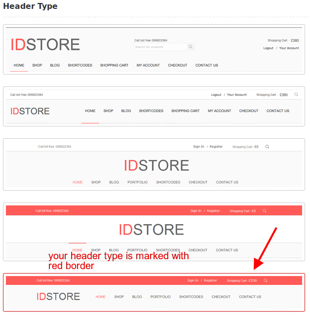
    Unfortunately I can’t the problem with the logo. You’ve chosen the type header #5 where logo is on the left.
    header

    Could you please show us a screenshot where logo is displayed incorrectly?

    Regards,
    Eva Kemp.

  • Viewing 12 results - 1 through 12 (of 12 total)

The issue related to '‘Product Arrangement not even’' has been successfully resolved, and the topic is now closed for further responses

8theme customization service
We're using our own and third-party cookies to improve your experience and our website. Keep on browsing to accept our cookie policy.