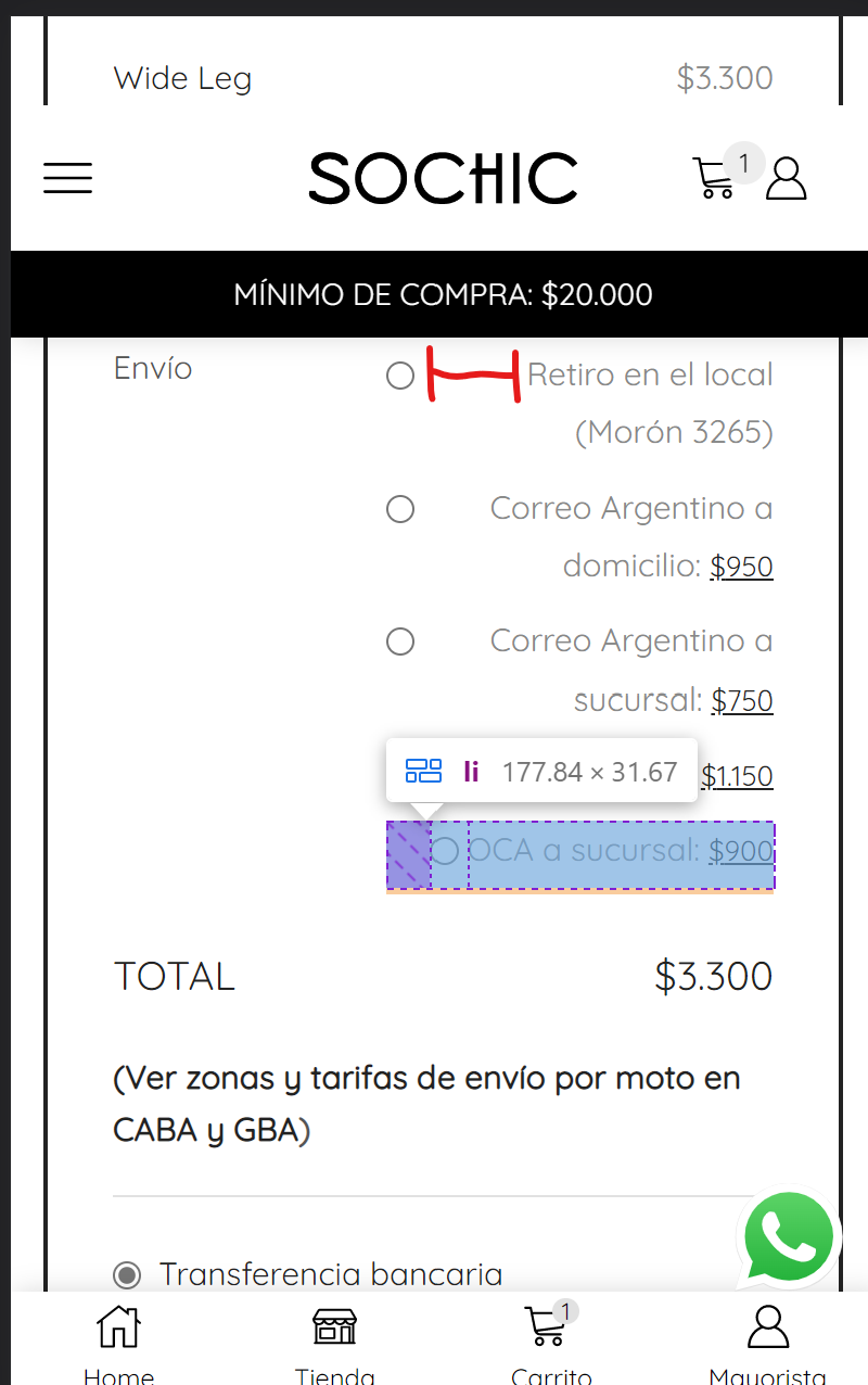
Hi there,
How can I reduce the space between the dot and the text on the checkout page on mobile version?

Thanks a lot!
This topic has 3 replies, 2 voices, and was last updated 2 years, 7 months ago ago by Jennifer
Hi there,
How can I reduce the space between the dot and the text on the checkout page on mobile version?

Thanks a lot!
Hello, @Jennifer,
Thanks for using our Theme and for contacting us.
In order to solve your issue simply go to the Dashboard >> XSTORE >> Theme Options >> Theme Custom CSS >> Global and then paste the below code at the bottom of the CSS box.
@media(max-width:786px){.page-id-34813 #shipping_method label{width:125px !important;}}
Then save settings and check back to your site after clearing the browser cache. The result will appear like this: https://postimg.cc/rRNHG6gk
Regards 8Themes Team.
Thanks a lot!
As always, works great!
kind regards,
The issue related to '‘Reduce the space between text and dot on checkout page’' has been successfully resolved, and the topic is now closed for further responses

